On the surface, you might think that creating a one-page website would be easier than creating a multi-page one.
But the truth is, designing a one-page site is actually harder than it looks.
After all, you only have so much retail space on your site to adequately inform site visitors about your brand and convince them to take action. And don’t forget, you need to make your site user-friendly and visually appealing too – it simply can’t go on and on.
If you’re thinking about creating a one-page website, and you want it to convert the most visitors possible, check out these 5 tips before getting started. These critical elements (plus examples!) will help you with the design and functionality of your website and propel you towards success.
So, let’s get started.
1. Embrace Minimalism
A one-page website that reads like a book is going to turn site visitors away from the start. That’s why you should embrace minimalism.
Here are a few pointers:
- Rely on clear, bold headlines
- Make use of whitespace
- Keep paragraphs brief
- Use images to break up sections
- Utilize icons and bullet points
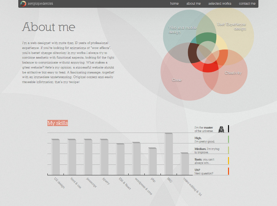
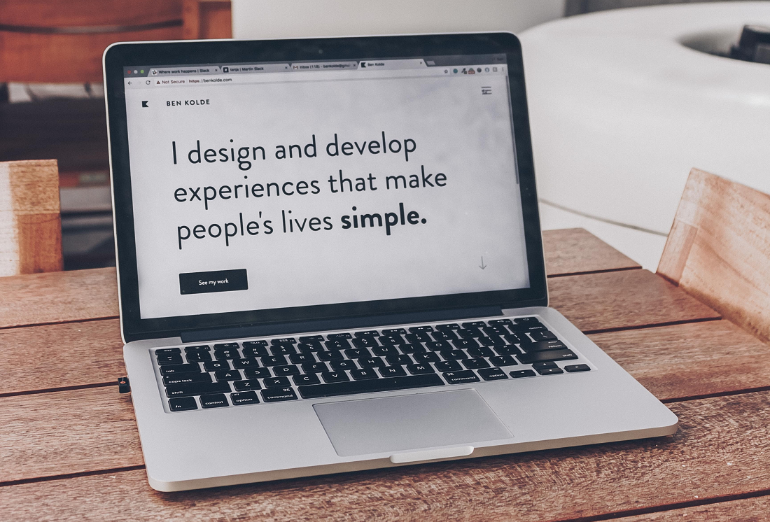
Notice how the one-page website above strips all the information to its bare essence. The about, skills, and selected works sections give prospective clients just enough information to determine whether they want to get in contact or not.
2. Understand How People Scan
Knowing that people tend to read written text in an F-pattern will help you design your one-page site so people stay engaged.
In fact, this is how the average site visitor scans text:
- Across the top of the page to read important headlines and scope out calls to action
- Down the left side of the page to view bullet points
- Across the page again to read bold text and subheadlines and view images
The key is to create your site so that it flows as naturally as possible, without overwhelming the user or keeping them empty-handed and confused. This will come with proper use of white space, strategically placed chunks of text, and complementing images. Kind of like Protargol does:
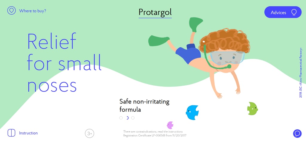
Funny how something as simple as nasal drops can seem so exciting with a great looking one-page site right?
3. Have a Clear Call to Action
There’s nothing worse than landing on a minimal one-page website and having no idea what the site owner wants you to do.
Are you supposed to sign up for a service, make a purchase, or subscribe?
If site visitors don’t know what you want from them, they’ll never convert.
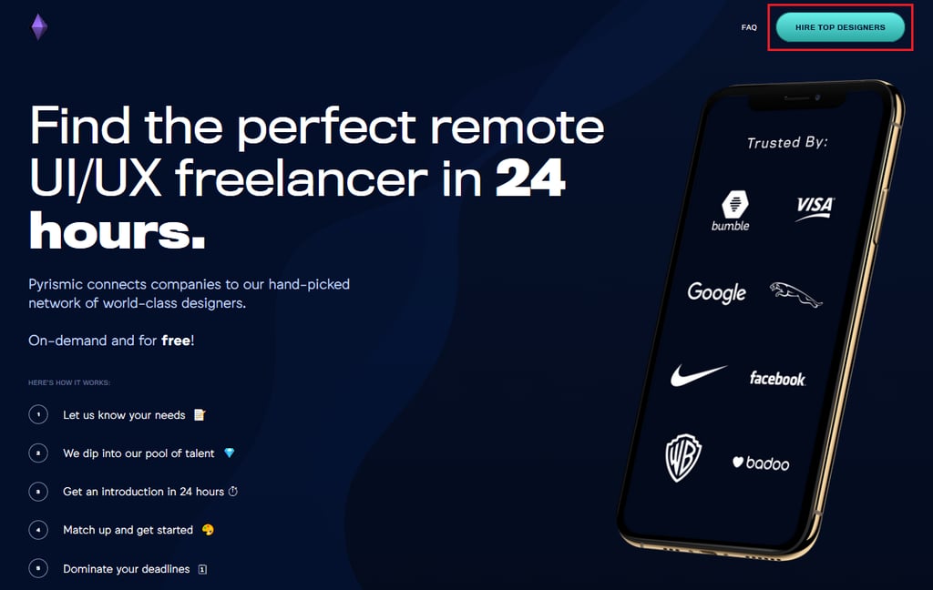
When you create a one-page website, the goal should be to get people to take one single action, just like Pyrismic does:
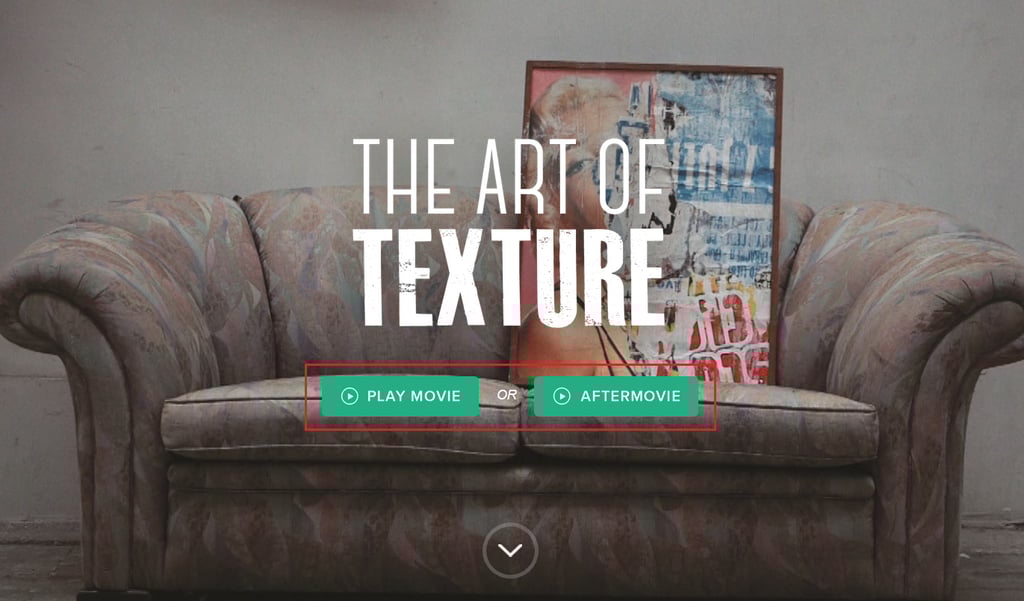
Feel you have to give people two calls to action? That’s okay, so long as it’s clear. For example, The Art of Texture gives site visitors a choice of action on their one-page site.
4. Try Using Parallax Scrolling
Parallax scrolling is a unique way of making the background image move more slowly when compared to the forefront elements (such as text and images) as users scroll up and down (or in this case side to side)
Need an example or a little inspiration? Check out how Cyclemon does it:
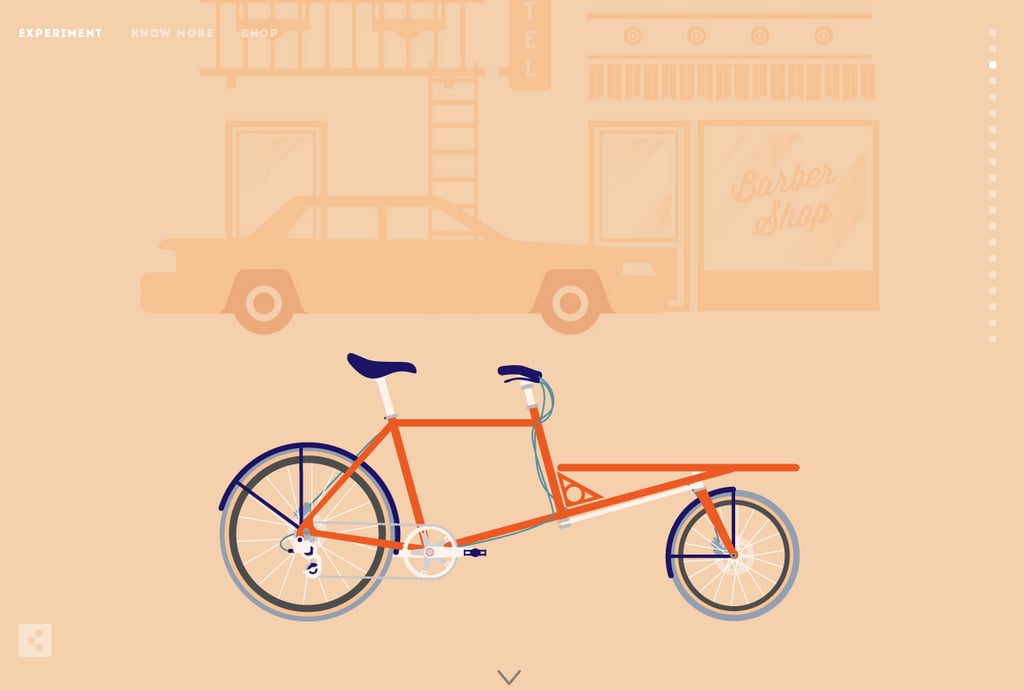
Notice the smooth parallax movement as you scroll down the site. In addition, notice the arrow icon on the bottom and sidebar navigation for jumping to specific sections. All of this combined makes for an exceptional user experience.
That said, before you jump into using this advanced design, make sure to consider the following:
- Loading Time: image layers and animations like parallax scrolling have the potential to slow your website down. If your website takes too long to load as people scroll, they’ll abandon your site before converting. Make sure to test your internet speed and optimize your website for performance so this doesn’t happen.
- User-Friendliness: some people don’t like fancy elements on the sites they visit. It’s important you research your target audience before implementing such a drastic design on your site. After all, cool web design does nothing for you if no one converts.
- Responsiveness: if a large portion of your site visitors come from mobile devices, you might reconsider using parallax scrolling. Parallax does not usually work on mobile devices and may negatively impact your conversion rates. Of course, you can always choose to turn parallax off on mobile devices, but this may not be worth it.
5. Animate Things
When it comes to creating a one-page website that converts, it’s crucial you avoid being boring.
One way to escape simply placing a bunch of text on one page is to add some animation to your site like Every Last Drop does:
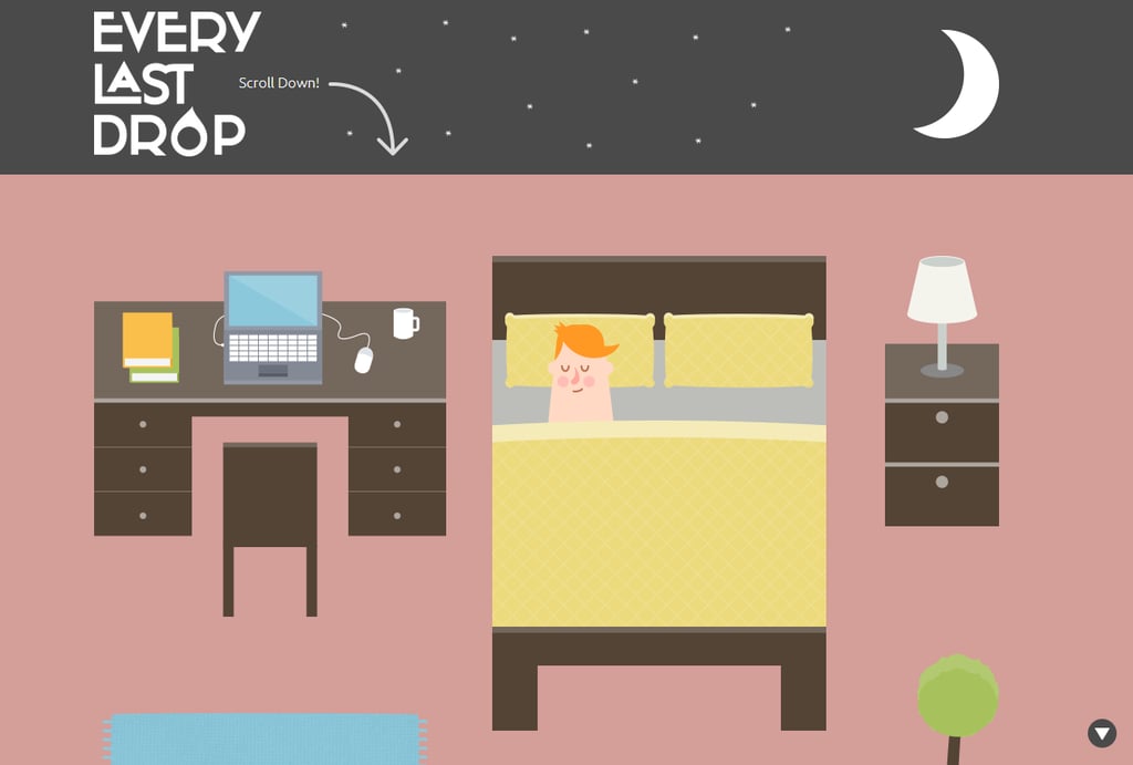
Just make sure your website makes sense to people. The above example may look cool, but unless you know exactly what the message is (which becomes clear at the end of the webpage) it can be kind of confusing.
Want to add animations but be a little more subtle? Check out how Danish Sait includes small animations on their homepage.
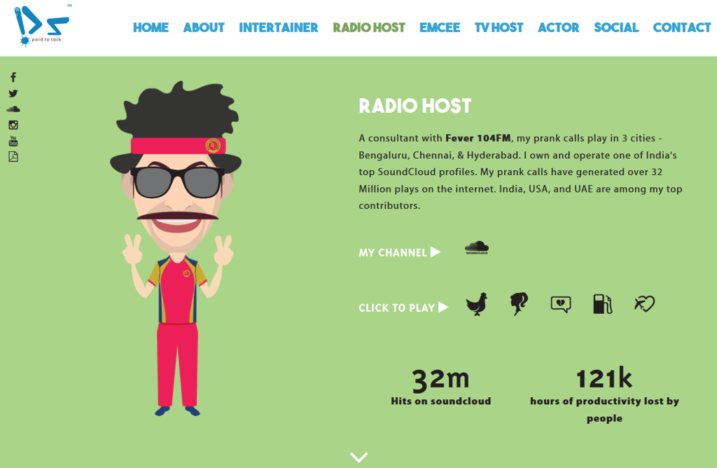
The mixture of written text, video content, imagery, and small animations makes this site exciting and keeps people engaged all the way down to the bottom.
Wrapping Up
And there you have it! 5 tips for creating a one-page website that converts.
One-page websites help you to tell the story of your brand, keep people’s attention, and ultimately convince them to take action – but only if you do it right.
If you’re still thinking about building a one-page site for your online business or blog, but feel the whole idea of designing it yourself is going to be too much trouble, get in touch with us here at Keen to Design.
Not only can we help you design your one-page site, we’ll make sure that everything functions the way it should so your site visitors can convert how you want them to. And don’t worry, we’ve things like SEO optimization, content promotion, social media advertisements, and remarketing covered too so you’ll have nowhere to go but up.
Posted by Pjay P. , Lead Designer at Keen To Design