From a design perspective, we are in an era forged by information, where most of what we read is online. Everything can be -and probably is- displayed on a screen, so design plays a great role here. It is important that designers create clear and smooth layouts for their projects. Whether websites, blogs, eCommerce sites or just newsfeed sites, the design must be simple and likable and white space will help to achieve that.
However, first, what is white space in web design?
Commonly known as negative space, it is a portion of space left untouched, the blank space.The readability factor is significantly enhanced by the use of white space, making text easier to read and understand. In web design, it is that space between graphics, images, columns, text, margins any others elements present on the website. White space is particularly used to smooth things out with elegance and design.
There are many reasons why white space is to be applied in web design, here are some of them:
- Enhancing of content legibility: Users should see where they are heading while having a reason to keep on reading. White space between paragraphs and around images helps them to understand and to have a better experience while exploring the page.
- It makes your page more interactive: As a general rule, visitors are always in a rush when navigating through websites. A decent proportion of white space allows fewer distractions that could slow viewers. It helps to draw attention exactly where it´s supposed to be.
Highlight Call to Actions (CTAs) in your Website Design
Make things bigger (pictures, buttons, and others.) might be a good way to draw attention to them, but surrounding them with white space can be as effective or even more.
Neat equals extraordinary
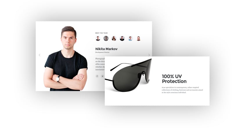
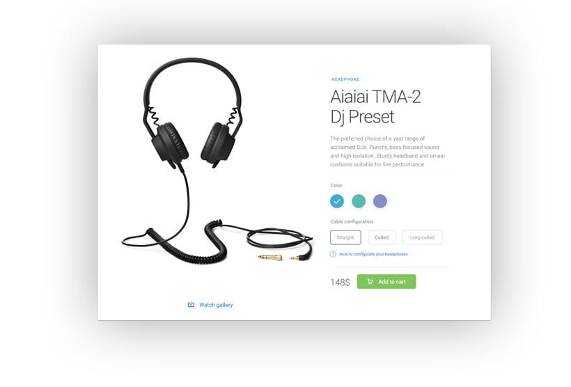
A remarkable and well-designed web page is just a matter of harmony between its elements. Solid layout and colour schemes , along with high contrast are as important as the way you organise them and the space left between them. Using white space does not mean you are going minimalistic, but using it in the right proportions might give your site the elegance and appeal the viewer is looking.
It brings balance
A lack of white space in your web design might lead to confusion, disorganization and also makes it difficult to read and enjoy. Achieving a balanced white website design is crucial to avoid confusion and disorganisation. Those are things you do not want your viewer to think while looking at your work. Now, going towards the opposite direction, an excess of white space could be associated with a lack of content and as a consequence the loss of the viewers attention.
The key to prevent that is harmony and balance, leaving space where it needs to be and in the correct proportion and you will see how your site obtains elegance and attractiveness.
Our society gives a gargantuan relevance to the visual presentation of the service, events, or whatever they are interested. Of course, colour impacts on that decision but so does organisation and elegance, and it is there where white space takes place. With time and practice, the use of white space will become natural for you and the website design will look attractive.
Why is White background crucial for your Website Design?
Website designers are creative souls who enjoy going boldly where no other designer has gone before and aren’t afraid to break a few rules to get there. Professional designers would agree that there are exceptions to every rule, and you can and should break some rules to pull off a design if the situation warrants it.
However, in the case of a white background, it’s very rare for websites to benefit when designers stray from this rule.
We’re not saying you should use white all the time but here are a few reasons why a white background is most often the wisest choice in website design.
Affects User Experience and Engagement
A white background can significantly impact user experience and engagement on a website. When designed well, a white background creates a clean and minimalist look, allowing users to focus on the content without unnecessary distractions. This simplicity can enhance readability and make navigation more intuitive. However, a poorly designed white background can lead to eye strain and decreased user engagement. To avoid this, consider using a white texture background to add depth and visual interest. Balancing white with contrasting colours and textures can also create a more engaging and dynamic user experience, ensuring that visitors stay longer and interact more with your content.
Impacts Website’s Overall Aesthetic
A white background can greatly influence a website’s overall aesthetic, giving it a modern, clean, and professional appearance. However, if not used thoughtfully, it can also make a website look sterile and uninviting. To avoid this pitfall, designers can combine white with other design elements, such as geometric shapes and colourful backgrounds, to create a more visually appealing design. This approach not only enhances the aesthetic appeal but also provides a clean canvas for showcasing other elements like images and typography, making the overall design more cohesive and attractive.
Light Fonts on Dark Background are Uncomfortable for the Eyes
When you use light fonts on a black background, the light bounces around on the screen and gets all mashed together before it hits the eyes. As a result, readers must struggle to bring the words into focus, which makes the reading experience uncomfortable.
Dark backgrounds also tend to reflect light back into the reader’s eyes, which has the effect of making the text appear jumbled. The result; your visitors are more likely to hit the back button to escape the torture, rather than struggle through the rest of the page.
Pure black on a pure white background doesn’t always work either, as the extreme colour contrast causes the eyes to work harder than they should. Instead, designers should use dark greys on white for reduced eye-strain.
White Backgrounds are Traditional
Humans have been reading black text on white backgrounds since the dawn of the printing press, so we are used to it. Plus, when it comes to writing stuff down on a physical notepad, black isn’t the go-to page colour; it’s usually white. If people do choose a non-white colour for their notebook, they invariably use pale colours and never black.
When websites became a thing, the default background colour of choice was white, leading to the prevalence of white websites, just because that’s what the people wanted.
Strange Choices in Background Colours Rarely Work
As the World Wide Web made its way into more homes and amateur designers were throwing up websites all over the world, the benefits of a white website became more apparent. There was much experimentation happening, with flashing text on fluorescent backgrounds sending people straight to the back button.
Some of the designs could have been called successful, but the majority deserved nothing more than the delete button.
All Colors Match with White
When you use many images in your design, and you stray from the traditional white background, you are going to struggle to find pictures which will work naturally with your colour choice.
With a white background, you can rarely go wrong, as all colours naturally go well with white. As an example, if you have a grey background and you come across an image that perfectly complements your message, but it’s predominantly blue, it will look terrible on your dark themed page. However, you won’t have the same problem if you stick with white.
Cultural Acceptance
Today’s website is a multicultural affair; you just never know who is going to land on your site as they could be in any country and have any type of cultural background. White is a neutral colour which signifies calmness, peace, or joy in many cultures around the world.
If you decide to go with a colour other than white, your choice might not reconcile with some of your viewers because of the culture in which they grew up.
White is Evergreen
Fashions change on the web – remember when everyone was going for the 3D look and were creating all of those terrible 3D buttons which flashed and did a dance whenever the mouse cursor came near?
Thankfully, the web has transitioned into a more reasonable and eye-friendly flat design. White has always remained a staple colour choice, has never gone out of fashion, and is not likely to in the future.

Dark Backgrounds Can Alienate Your Older Demographic
Some designs are hard to look at even for young eyes, so imagine the torment you will be inflicting on your older visitors if you go with less traditional and darker design choices for your website background.
White Creates a Feeling Of Openness
Using darker colours as background on a website can often lead to a page that feels cramped, constricted, and difficult to navigate naturally with the eyes.
Using a lighter shade opens up the design and gives the impression of more room, which allows you to fit more information on the page while maintaining the flow.
You can Use Different Shades of White
You aren’t stuck with a pure white background, as you can always choose a shade that is slightly off-white to give your page some extra personality, while still having the design advantages white backgrounds provide.
Responsive Design is Easier
In responsive layouts, a non-white background needs complicated CSS and HTML coding to show up correctly on multiple devices. If you use white, the edge of your design will be invisible, so no coding is necessary to ensure the edges are the correct colour.
On occasion, dark-themed websites can capture the essence and emotion of a business, but careful consideration is needed, and these designs can be quite tricky to pull off. White is universal, is easy to work with, and fits in perfectly with just about every design element of a web-page.
Sets the Tone for Your Brand’s Identity
A white background can effectively set the tone for a brand’s identity, conveying simplicity, elegance, and sophistication. However, it’s important to consider cultural perceptions, as white can symbolize different things in various cultures. For instance, in some Asian cultures, white is associated with ill luck. Therefore, understanding your target audience is crucial when deciding on a white background. Despite these cultural nuances, a white background can help create a consistent brand image across different platforms and mediums, reinforcing your brand’s identity and values.
Enhances Accessibility for Visually Impaired Users
A white background can enhance accessibility for visually impaired users by providing a clean and simple design that is easy to read and navigate. However, it can be overwhelming for users with visual sensitivities if not used correctly. To mitigate this, designers can use a white texture background to add depth and visual interest while ensuring sufficient contrast and balance. This approach not only makes the website more accessible but also creates a clear and consistent design that is easy to follow, improving the overall user experience for everyone.
Use White Texture Background to Add Depth
Incorporating a white texture background can add depth and visual interest to a website, making it more engaging and dynamic. A textured background can create a sense of warmth and coziness, making the site feel more inviting and welcoming. Additionally, it provides a clean canvas for showcasing other design elements, such as images and typography, without overwhelming the viewer. However, it’s important to use texture sparingly to avoid a cluttered and overwhelming appearance. The key is to strike a balance that enhances the design without detracting from the content.
Balance White with Contrasting Colors and Textures
Balancing a white background with contrasting colours and textures can create a more engaging and dynamic user experience. A white background offers a clean slate for showcasing other design elements, such as images and typography, while providing sufficient contrast and balance. Using contrasting colours and textures can add visual interest and depth, making the website more interactive and appealing. However, it’s crucial to avoid overusing these elements, as too much contrast can make the website look cluttered and overwhelming. The goal is to create a harmonious design that captivates and retains the viewer’s attention.
By following these guidelines, you can ensure that your website not only looks aesthetically pleasing but also provides a superior user experience, reinforcing your brand’s identity and values.