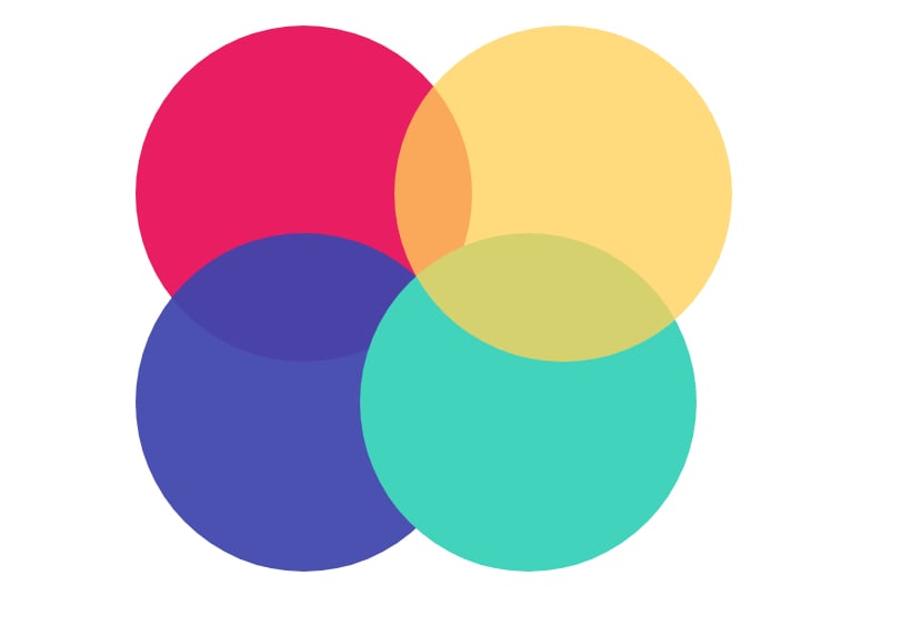
96.2 percent of people admit that they place the most importance on visual factors when purchasing products. Not to mention, brand recognition improves by as much as 80% when the right color palettes are used.
So what does this mean for your online business?
It means that you should prioritize the color schemes you use to brand your business and design your website. After all, the number of subscribers your blog receives or the amount of revenue your eCommerce shop generates depends on it.
Finding the right color schemes to use on your website can be tough unless you have some knowledge about color theory and design. That’s why we’ve rounded up the easiest to use online color palette generators to help.
Let’s check it out.
Table of Contents
- 1. Material Design Palette
- 2. Palettable
- 3. Palette Cam
- 4. BrandColors
- 5. Colr.org
- 6. Coolors
- 7. COLOURLovers
- Sources for Getting Modern Color Inspiration for your Website Design
- Modern Color Inspiration for Website Design
- Contrasting Colors for Exceptional Website Readability
- Harsh tones cast a bad impression
- Discuss the business colors
- Understand the personality of the colors
- Background color
- Use the color contrast checking tools
- Colors theory in Web Design and Why it matters
- Colors theory in Web Designs
- Color helps you remember
- A visual era
- Colourful emotions
1. Material Design Palette
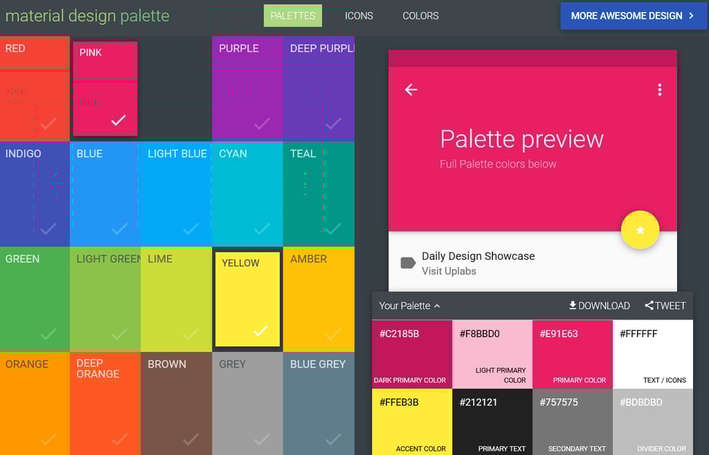
Material Design Palette is a simple color palette generator to use. All you have to do is choose two colors you like and let the generator do the rest.
After picking two colors, this online color generator creates an 8 color palette, complete with hex codes that you can use on your website. You can even copy the color codes to your clipboard if you’re planning to use a specific color right away.
If you want, you can share your favorite palettes with others on social media. And if you like the entire palette, you can download it via CSS, SASS, LESS, SVG, XML, PNG, or Polymer, which makes tracking and organizing your favorite color schemes a cinch.
2. Palettable
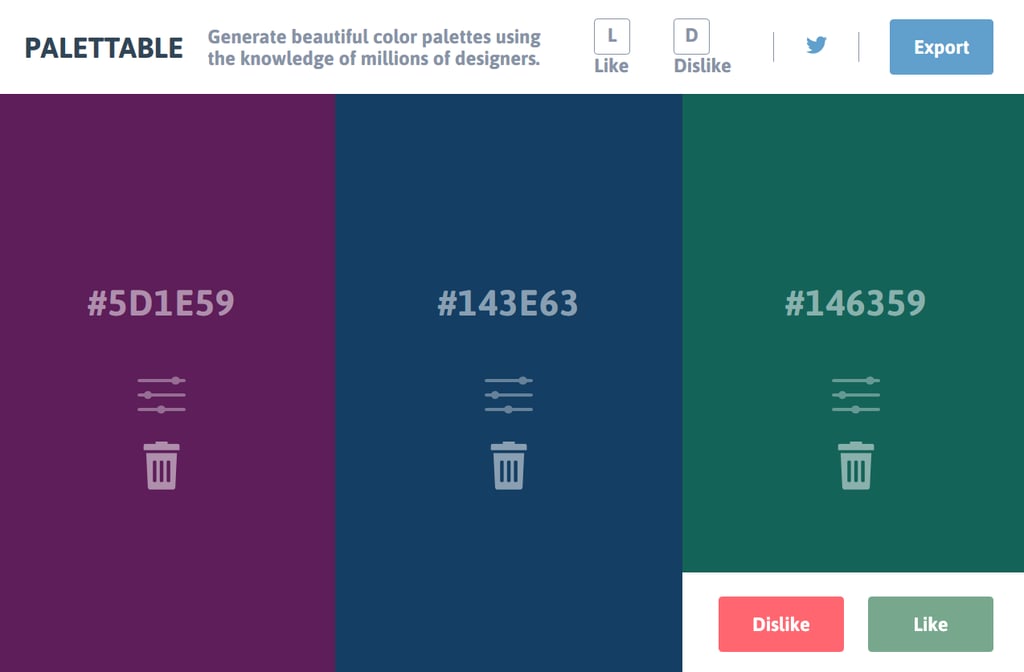
Palettable is a fun online color palette generator that lets you choose the colors you like one by one (by clicking Like or Dislike) to create the perfect 5 color palette. Once you’ve created the entire color scheme, you can export it via URL or PNG for use on your projects.
Specialized algorithm matching and professional designers that give input on color combinations are the key to customizing your color palettes. And if you want to make small adjustments to a color you like, such as change its hue, the color generator allows you to do that.
3. Palette Cam
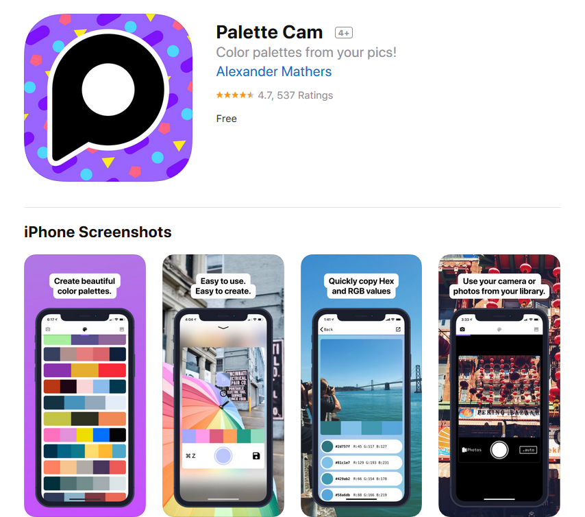
Have you ever been out and about running errands and come across a stunning color palette that you fell in love with?
If so, Palette Cam is the tool for you. This free tool lets you take a photo with your mobile device and see the color palettes of the natural world. You can create your own custom palette or gather your favorite hex codes or RGB values to use on upcoming projects.
In addition, Palette Cam lets you view color schemes in the images found in your image library and even access the inspiration page to help spur some creativity.
Unfortunately, this isn’t an online tool that just anyone can use. Though it is free, the application is only available in the App Store for iOS devices.
4. BrandColors
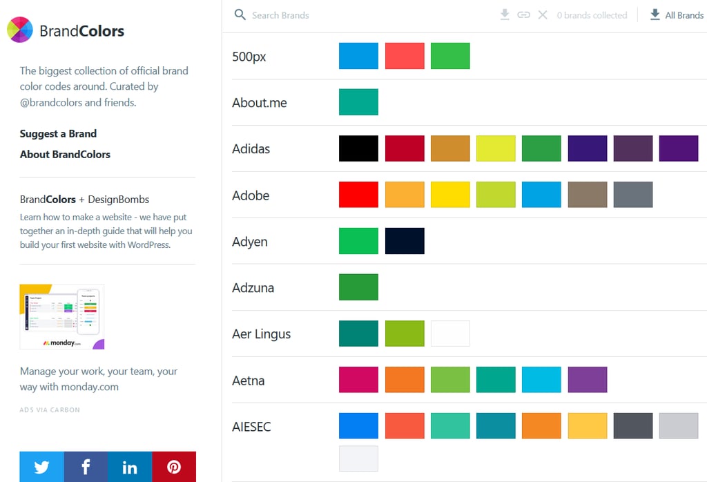
BrandColors is a neat tool for those that find inspiration in the color palettes of other well-established brands.
Used mostly as a reference site, BrandColors lists in alphabetical order tons of businesses that use tried and true color schemes that have propelled them towards success. In fact, it includes companies such as Delta Airlines, Adidas, and even eBay.
When you find a palette you like, you can download it in ASE (Adobe), CSS, SASS, LESS, or Stylus. And if you poke around enough, you can find the hex codes of your favorite colors and even copy them to your clipboard.
Lastly, if you aren’t sure how to use a certain color scheme that you like, you can click on the link to the brand’s website and see it in action. You never know, this might give you enough ideas to create your own custom color palette for your website.
5. Colr.org
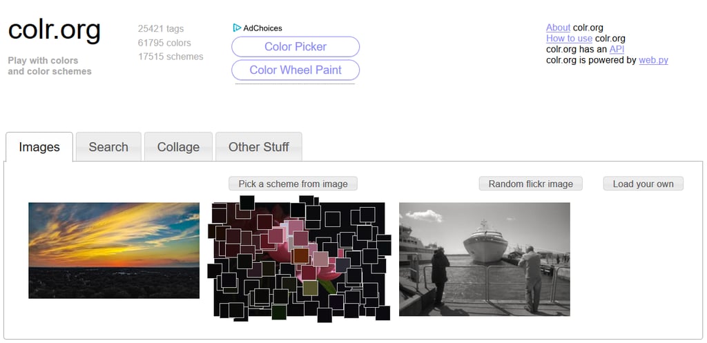
Colr.org seems a little outdated at first glance, but offers a unique approach to picking the right color palette for your web design needs.
It starts by offering a few randomly generated images. Some have color and some are black and grey. When you hover your mouse over an image you like, it pixelates the individual colors so you can pinpoint specific colors you like.
Simply click on a color and reveal its hex code. Take it a step further and find matching colors to add to your palette. Plus, find additional images if what you’re looking for are images to add to your website that match your site’s color scheme.
Is there a website you want to model your own color palette after? Run a quick site search using Color.org (found under the Other Stuff tab) and find out what colors they’re using.
6. Coolors

Coolors is one of the easiest color generators to use. Simply hit your spacebar to create a unique color palette. If you find a specific color to you like, click on it to lock it in. Then, keep hitting spacebar to add more colors to your custom color scheme.
You can create your own color profiles and file palettes under names and tags for easy retrieval in the future. You can also export or save your color schemes as SVG, PNG, SVG, SCSS, or COPIC.
And the best part? You can download Coolors as an iOS app, an Adobe Photoshop or Illustrator plugin, or a Chrome extension.
7. COLOURLovers

COLOURlovers is a color generator that has a lot going on at once, but is a valuable tool to have in your web design arsenal.
Browse color palettes contributed by millions of users, as well as commercially-generated palettes that have a more professional look to them. And if you want to learn about color theory and web design to help you with your design endeavors, be sure to check out the articles they have for COLOURlovers users.
Additionally, you can sort palettes into New, Most Loved, Most Comments, and Most Favorites. You can also click on a particular palette you love to find the hex codes and RGB values. Lastly, download palettes in CS, SVG, Design, WPF, XAML, ASE, ACO, AI, GPL, HTML, and ZIP formats.
And that’s it! 7 color palette generators that are easy enough even for the most novice of designers.
Deciding which color palette is the right one for your website and brand can continue to be challenging, even with the best color generators on hand. If this is a problem you’re running into, get in touch with us and see how we can help.
We have the experience and knowledge needed to design websites that have only the most visually appealing color schemes. Using our own custom framework, and out-of-the-box themes, we know what it takes to create unique websites that not only look good, but also convert more customers too.
Sources for Getting Modern Color Inspiration for your Website Design
Color is an essential element of every marketing campaign and is especially important in branding. The ability for colors to influence the mind and emotions of consumers and affect how they perceive a brand means that the colors chosen for a logo are as critical a component as the shapes and lines used in its design.
The Importance of Color in Design
Blue is the color of the ocean and has deep links to feelings of strength, tranquillity, reliability, and professionalism – part of the reason why brands such as Dell, IBM, and AT&T use it so extensively in their logo designs and marketing material.
Red is a color of energy and passion, a property not missed by many famous fast food franchises and restaurants, and green is a positive color representing growth and sustainability, or young and playful.
Color can mould a person’s perception of a company; yellow is the color of the sun and evokes feelings of certainty, friendship, and warmth – it’s also the color most associated with wealth and good luck.
When brands want to evoke feelings of happiness and fun, yellow is their color of choice. Yellow has been working well for McDonald’s with their iconic golden arches, but such a color scheme may not work so well for an insurance firm.
Modern Color Inspiration for Website Design
With research showing that proper use of color can increase brand recognition by up to 80%, choosing colors for your logo or website is not a frivolous exercise and deserves some attention. The colors you use should evoke your brand’s values and enhance its identity.
The limitations imposed by a small set of natural pigments during the age of print media have been replaced with an explosion of possibilities, made possible by LCD screens capable of displaying millions of colors and synthetic pigments also creating a much wider range of options in colors and hues.
While more choices can be liberating, such a full gamut of color options has also managed to make finding the right color scheme a challenging prospect; but then, what designer doesn’t love flexing their creative muscle when faced with a challenge?
With the ability to amplify your message and appeal to your target demographic using color, all that is needed now is a little more inspiration; here are seven places you can find it.
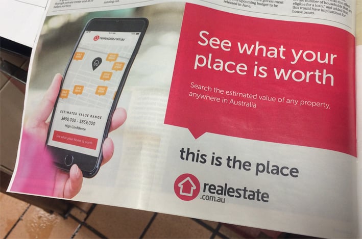
1. Advertisements in Digitally Distributed Newspapers
As printed newspapers are on the wane the way to satisfy the need to know what’s happening around the world is through digital copies of today’s publications. The advantage to this, of course, is that it’s easy to analyse the color scheme of every advertisement you see in the spread once you cut and paste the image into your favourite bitmap editor. For Examples: PDF Magazines available on Issuu, advertisement in daily newspapers et.c.
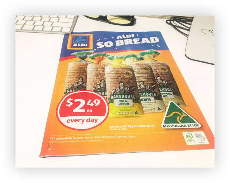
2. The Supermarket Website/ Catalogues
Supermarket shelves are loaded with color schemes, which food producers have spent millions of dollars on market research to discover. You can take advantage of any color schemes which appeal by either taking a photo with your phone. You can also copy or screengrab the image by visiting the manufacturer’s or supermarket’s website.
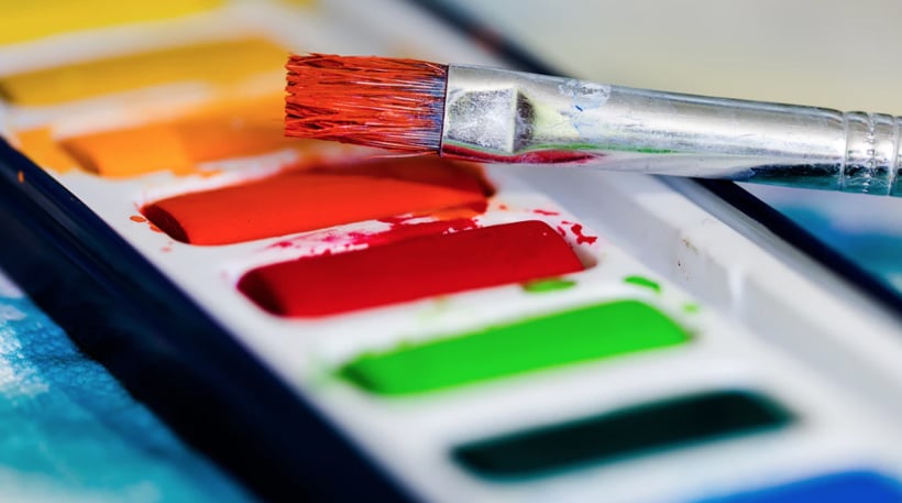
3. Color Swatches from Paint Dealers
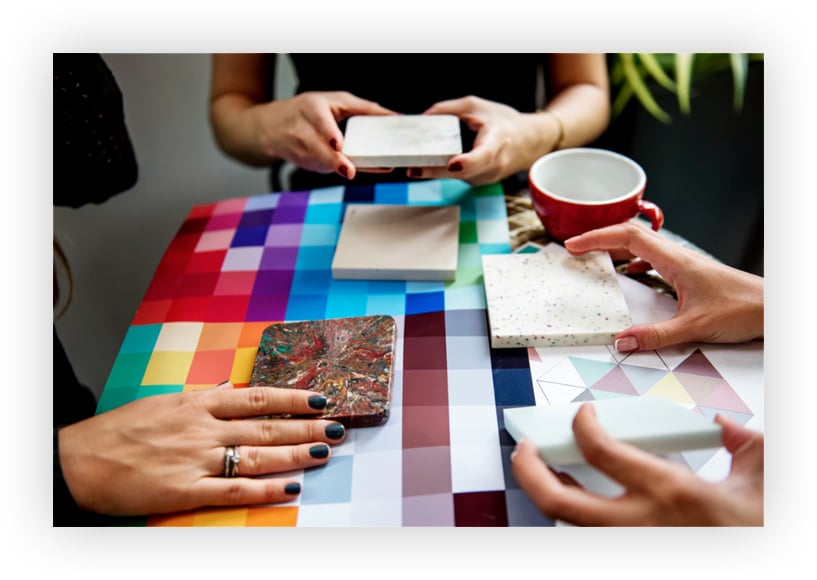
Hardware and paint stores carry color swatches of all their available paint colors, so grab a few swatches of color schemes that appeal and use your scanner to good effect. If your creating a design which will also be duplicated in physical print, then a color swatch is also a great way to see exactly how it will look on paper.
Physical Pantone sets are another resource a designer can keep on hand to view how colors look in the real world. Pantone color sets also include handy references like Hex color codes for each color, and a useful guide showing the best way to produce that color in physical print mediums.
4. Your Camera or Smartphone
All smartphones contain a camera these days, with the higher-end models sporting some fantastic true-to-life color reproduction abilities. You can take advantage of this by snapping a digital image of any images or logos you see while you are out and about. While you are walking around the city, you will come across thousands of logos and images, any of which can be a source of inspiration for your logo and website design.
Adobe Capture CC is an app by Adobe with a color extracting tool and a full library of color schemes for you to browse, with the ability to load the color schemes directly into Photoshop. Using Adobe Capture, you can capture an image and turn it in to pattern, color theme, shape and brushes.
You can watch the video below on how to use the Adobe Capture CC.
5. The Internet
You can find heaps of color inspiration online by visiting sites which specialise in helping designers find the exact color scheme they need. BrandColors lists brands and their color schemes in alphabetical order so you can quickly research color schemes suitable for your industry.
If you want to take the hard work out of manually creating a color scheme from a photo, you can with Pictaculous. Upload a photo for Pictaculous to analyse, and you will be provided with color suggestions and palettes based on the colors appearing in the image.
These are just a small sampling of what is available, as there are many more options available on websites, Android tablets and phones, and iOS devices.
6. Pinterest
Pinterest is a cornucopia of ideas for creative sorts as the site makes it very easy to search for inspiration. You can start off with a general search such as “color palette,” or you could get more specific and type in a term such as “winter color palette” to collect ideas on whatever color your design and industry demands.
7. Look at Colors Created by Nature
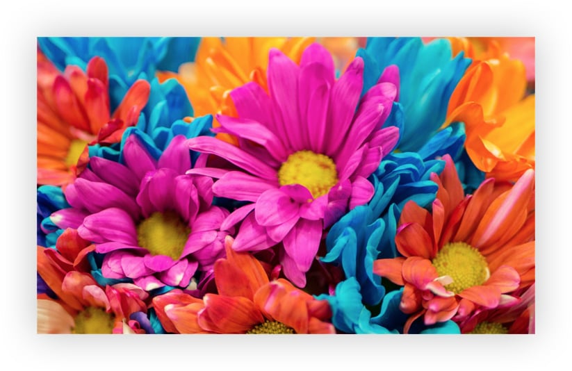
There are not many things more pleasing to the eye than that canvas of life that is mother nature. The rich tapestry of the world around you can provide you with heaps of inspiration as you check out landscapes, fruit, foliage, and fields of flowers. So, if you have been stuck indoors and your search for inspiration has come up empty, try stepping outside for a bit, or jump in the car and take a trip out to the country.
Conclusion,
There is no doubt that mismanagement of a color palette can ruin an otherwise excellent website or logo design and cause it to miss the mark in delivering its intended message. If you spend some time on understanding the psychology of colors, you will be able to come up with a design that appeals and speaks to your target demographic.
Contrasting Colors for Exceptional Website Readability
With the advancement of internet technology now most of the businesses are finding it crucial to have their online presence to gain customer focus and attention. Designing a website is a tricky job as the design of a site is the first thing that the visitor notice. Similarly, the color combination of the website also makes a significant impact on the overall view of the visitor. In today’s post, we will cover some of the tips to ensure the usage of perfect contrasting color to enhance the website readability.
The right use of the colors of the website designing can make or break the deal for you. If you want your website to attract the potential customers not only through the content but by the presentation also then put a little extra effort in using the color palette for your site.
Harsh tones cast a bad impression
Although the use of bright colors may seem beautiful and radiant, however, if you are selecting a color scheme for your website it would always be wise to choose the warmer tones. The colors should not be harsh to feel pungent at first glance because if the visitor ever visits your website, they may feel uncomfortable due to the whole harsh color scheme of the site. So, it is always wise to avoid the use of the harsh color scheme.
Discuss the business colors
If you are getting a new website for a business, then it is advisable to take into consideration the brand color that the company is currently using. Most of the time the colors a business use in its logos becomes the identity of the business. So you have to keep in mind to use the similar color scheme to give the site brand identification.
Consider the target audience
While creating a website, one of the most significant factors that matter is to consider the target audience at almost all stages. Moreover, when we talk about a color contrast for a website, we have to admit the target audience as well. If the site is targeted towards females, then the use of color would be different as compared to the one targeting male audience.
If you are designing a website for the elders, then the color scheme should be suitable and calm that does not hurt the eyes. Similarly, you have to watch for the industry the website belongs.
Understand the personality of the colors
Another essential aspect to be kept in mind while selecting the color palette is the personality of the color. As we are cognizant that each color has a unique personality and by choosing that color we imply that personality on our website. Some of the examples include black consider as the color of power and sophistication while pink depicts the feminism. On the other hand, red portrays passion, danger and zeal while purple represents royalty and success. So while creating a site always make your color selection according to the personality of the color and what your website is portraying.
Experiment with colors
It is quite annoying to use a single color for the entire website. It not only creates a dull impression but also discourage the visitors from visiting again. So to make your site more attractive, it is imperative to choose an accent color for highlighting the critical areas or the information. However, the selection of the right accent color is not easy, and you have to try various color combinations to get the right one.
Background color
The background color of your website is just like the wall of the room. You have to choose the color very carefully as it would slightly increase or decrease visitors’ interest. While selecting the background color, consider the type of website you are creating. For example, if you are creating a content-intensive site, then the background color should be neutral or white. This is because while building an informational website, the primary focus should be on the content and the neutral color of the background which diverts all the attention on the content.
While on the other hand, if we have to create a website for business then there are two kinds of background color selection for brand promotion or services promotion.
- If the site is focused on brand promotion, the background should include the color of the brand.
- If the website is for the promotion of the service, then like the content-intensive sites the background color should be neutral to bring the focus to the content of the site.

Use the color contrast checking tools
If you are creating a site for the first time or if you are not sure about the colour selection, then the best way to confirm your decision is the use of tools available for the color comparison. There is a humongous variety of tools available online which helps the website designer to choose the perfect combination. The use of tools would not only offer the variety of combinations, but it also saves your time. Try to use these tools to get the best idea regarding the various color combinations for your site.
Avoid the use of black
The use of black, although some classic, however, if you switch the black with the darker tone of grey, then it would offer a more subtle color to the viewers. Moreover, if you use a darker shade of grey, then you will not be able to recognise it even.
Always prefer readability
One thing that is most crucial in the whole website designing process is the readability aspect. All the colors that we choose are entirely based on the fact that they enhance the readability of the text. However, there are specific rules that we have to follow while selecting the text and background colors that can improve or decline the readability. Avoid the use of a dark background with the lighter text as it causes irritability in the eyes and also causes reading discomfort.
The color combination is the most crucial part of website designing process. Always seek the help of experts and latest tools to come up with the best color combination that not only attract the visitors but also enhance the potential customers.
Colors theory in Web Design and Why it matters
A single picture is worth a thousand words! It is easy to choose your favourite color and go towards your web design project, and that is because you like how it looks. There are of elements to consider too, such as photos, layout, content, and development. The primary purpose of this post is to focus on the importance of color and to give you a background on why it deserves your full attention while working on web design.
Colors theory in Web Designs
A major part on how your web page reflects derives from which color do you choose. It also makes a significant impact on how the public perceives your work. Taking a good look to other designs may help you to get a much better understanding of how color works on their perception. A web page with a high recognition could have dangerous consequences changing the color scheme when it is expected to well maintenance.
It is clear that color plays a significant role, not only in web design but also in brand design, marketing, and other areas. Moreover, such a great importance resides on multiple reasons, all of them coming from our minds. There are some of those reasons.
Color helps you remember
According to many psychologists “living colors” are more appealing to the senses because they boost your memory with scenes of the real world. Creating a memory from a colorful scene is way easier because they can be processed more efficiently than a transparent one, so as a result, you can remember them better.
A visual era
In the pre-historic era, the olfactory sense was our prime mean to survive, for that reason it was vital. Nowadays, we assimilate approximately 80% of our experiences through our eyes. Vision has become the primary source, very different than our ancestors who relied on their pre-historic noses.
Colourful emotions
A color is very much related to feelings; it is not unusual to see a color and have an emotional response towards that color. Blue, for example, is linked to sadness and calm while yellow expresses happiness, light, and caution. It is within our nature to naturally associate them with our emotions because it is hard sometimes to represent what we feel into words.
Web design is primarily a visual mean, and the color is a powerful weapon to enhance it, understanding its meaning gives you an invaluable way to make your website a great project. Choosing the right colour is not only picking the one you like, but it is also choosing the ones who will make your website robust and full of personality.
Feel free to experiment with each color, use different shades while working and deciding the scheme for your site. Have in mind that every person is completely different and that most likely colors mean something else for every one of them. Of course, it is impossible to satisfy everybody´s necessity so as a last recommendation, think about the target of your website before taking any decision.