Information architecture (or IA) is a crucial aspect of good web design with a big impact on your user’s overall experience.
Did they find the content they were looking for? If so, how easily did they find it? How quickly can your users get around your site and land on the “right” pages? All of these questions implicate the process of IA.
In this article, we’ll examine what IA is, and how it helps you improve your site’s user experience (or UX).
What Is Information Architecture?
The Information Architecture Institute defines IA as: “the practice of deciding how to arrange the parts of something to be understandable.” It’s the way you assemble your site, with the ultimate goal of helping your users find what they’re looking for.
IA isn’t the same as user experience or user interface, though it implicates both of these processes. With IA, we’re focused mostly on the content and how it’s arranged, organised, labeled and presented.
To put it another way, IA is the blueprint of your site’s design, which is expressed through wireframes and other mockups that UX designers then incorporate into their work. However, UX, UI and IA are all part of what drives your site’s level of user engagement.
Effective platform design ensures that your website functions seamlessly across different devices, enhancing the overall user experience.
Understanding Your Website Visitors
Knowing your website visitors is key to a great web design. Knowing who they are, what they are looking for and how they interact with your site will make a big difference to the user experience. This information can be gathered through user research, analytics tools and feedback forms.
To get to know your website visitors consider:
- Demographics: Get data on age, gender, location and occupation to tailor your content and design to them.
- Goals: What are your visitors trying to do on your site? Information, buy or support?
- Behaviour: How do visitors navigate your site? Which pages do they visit most? Where do they drop off?
- Preferences: What do your visitors like and dislike about your site? Feedback forms and user reviews will tell you.
- Pain Points: What are the hurdles your visitors face on your site? Are there any roadblocks?
By knowing your website visitors you can design a user-centric site that meets their needs and expectations. This will lead to a better user experience and more engagement and conversions. A site that speaks to its audience will achieve its goal.
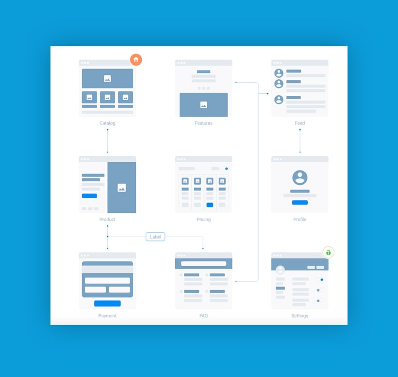
The Four Pillars of IA
Your site’s IA is comprised of four basic parts or pillars that support your site’s design and layout.
In addition to structural elements, understanding colour theory is essential for selecting a colour palette that effectively communicates your website’s message.
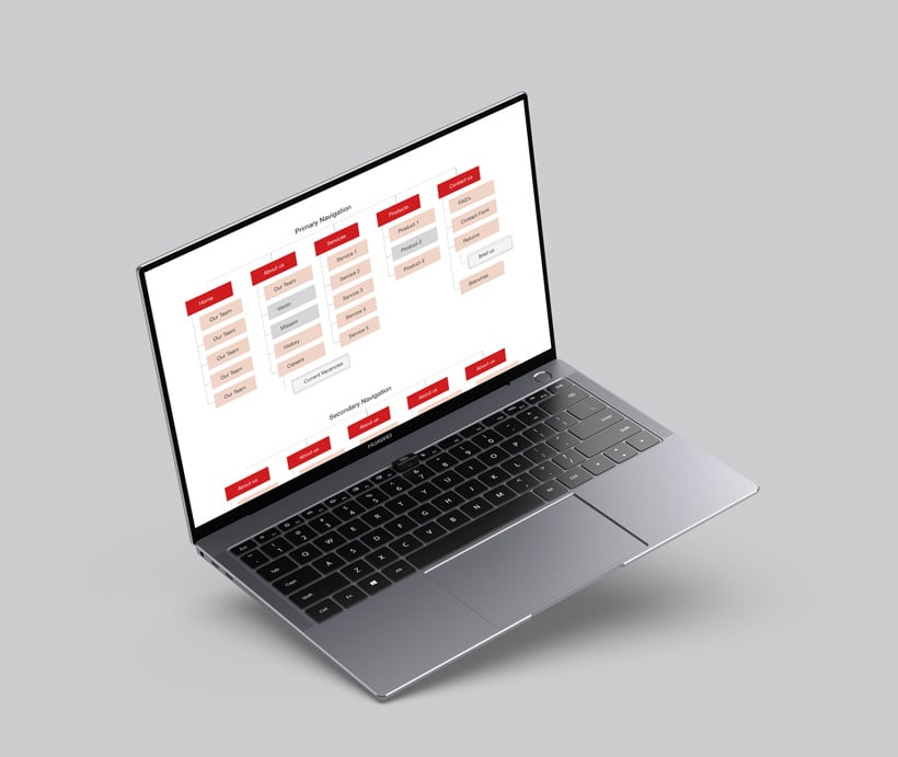
The first pillar is the organisational structure of your site. The most common structure is a hierarchy or the “top-down” approach which drills down to finer levels of detail. Other structures commonly used on the web include:
- Sequential: a series of steps or sequences
- Alphabetical or chronological: Based on alphabet or time period
- Audience: Divided into sections targeted at different kinds of users
- Matrix: Links in no specific order, allowing users to find their own paths
The second pillar is how you label component parts, sections, pages and navigational buttons on your site. For example, on the Keen to Design site, we employ a top-level navigational menu that runs horizontally across the top with labels such as “Home,” “Work,” “Capabilities,” “About,” and more.
Navigation systems are the tools that help users navigate through your website. Horizontal header menus, lists of links to featured posts in a sidebar, and drop-down menus for pages are all examples of navigational elements.
Finally, search systems allow users to find specific content with more precision. On most sites, this is represented by a simple search function with a text input box. However, search can work against a site’s usability if it’s not implemented properly.
Improving Your Site’s Organisational Structure
Take a moment to look at your site as if it were new to you. Is it clear what this site’s about, or do you have to search for that information?
To impose some order on your website, start by taking a thorough inventory of your site content. What is the main topic? How current is it? What are the main keywords for that page? Then take a look at the gaps in your content. What’s missing? Make a note of any pages, posts or other content you need to add to your site to fill in those gaps.
Next, organise your archived content into logical groups and sections. The structure you choose depends on your site’s goals and, most importantly, on your audience of users and prospects. For eCommerce websites, a well-organised structure is crucial to guide users through the buying process and enhance their overall experience.
If you have two kinds of users, each with a different pathway through your site, choose an audience-based organisational structure. Chart out the separate site tracks based on the separate needs of your audience segments.
However, many businesses are better off with the classic hierarchical scheme. For example, a law firm that offers representation in criminal, business, and immigration law would create separate top-level pages for each legal area, with more detailed content arranged by topic underneath each of those three major labels.
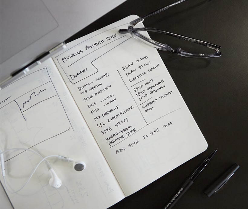
There are several digital wireframe and sitemap tools available, but you can also get the job done with a stack of index cards, one page to a card. Arrange the cards visually on a large surface to create the organisation scheme.
Refining the Labels on Your Site
While it’s tempting to create clever labels in an attempt to distinguish your site from the competition, it’s actually better to let clarity be your guide. Modern web users have become accustomed to certain labels. They expect to see “home” and “contact,” for example, and they know what these terms mean.
Using a single colour theme can also contribute to a clear and cohesive design, making it easier for users to navigate the site.
Space will also be a consideration for labels. The more characters you use in your labels, the more space they’ll take up on the page, no matter where they’re positioned. Brief, clear labels improve navigation and help the user figure out where to go next.
Streamlining Your Navigational Aids
Test all your navigational menus thoroughly. Menus with font sizes that cause overlap and unintended switching between submenus can lead to tremendous user frustration. Instead, keep your menus streamlined and well-designed to avoid those obstacles.
Make sure your navigational structure also reflects your organizational scheme. That way, the navigational scheme supports the organizational structure and vice versa.
Utilising the colour wheel can help in selecting complementary colours for your navigational elements, enhancing their visibility and usability.
Finally, keep navigational menus simple. Too much detail isn’t a good thing. You may find users prefer fewer choices for less visual confusion, and that a good landing page can solve a myriad of problems.
To Search or Not to Search?
Finally, give search some serious consideration before you include it on your site. Small sites (which most small business sites are) may not even need search functionality, which can fail in any number of ways, causing deep user frustration.
Too many results, vague results, no results at all—these outcomes will seriously damage your site’s UX and your brand’s reputation. If you provide a search tool, keep it in the same place on all pages and make sure you test it out thoroughly first.
Measuring Success and Iterating
Measuring your website is key to understanding how well it’s working and where to improve. Here are some metrics to measure:
- Website Traffic: How many visitors are coming to your website?
- Bounce Rate: How many visitors are leaving immediately? A high bounce rate means your landing page or content is probably not working.
- Conversion Rate: How many visitors are completing a desired action? (e.g. buying or signing up for a newsletter)
- User Engagement: How long are visitors spending on your website and how many pages are they viewing? High engagement means a good user experience.
Use analytics tools like Google Analytics to measure these metrics. They’ll give you insights into how visitors are interacting with your website and where to improve.
Now that you’ve measured your website’s success, it’s time to iterate and improve. This might mean:
- A/B Testing: Test different versions of your website to see which one performs better. Data-driven decisions.
- User Feedback: Get feedback from visitors to understand their needs and wants. Use this to make informed decisions.
- Design Updates: Update your website design to improve the user experience. This might mean changing the layout, colour palette or UI.
- Content Updates: Update your content to keep it fresh and engaging. This will keep your audience coming back for more.
By measuring your website and iterating you can create a website that’s optimised for your target audience and achieves your end goal. Continuous improvement is key to a successful website design that adapts to your users changing needs.
Conclusion
IA principles give site owners a reliable site framework that enhances the overall user experience and consequentially improves search rankings, time on site, user trust, and more.
Start with a solid understanding of your audience of users: what they want, what they’re looking for, what they need to do on your site. Keep the four foundational pillars in mind and make strategic decisions about each of those pillars as you incorporate them into your site. The result will be a useful, user-friendly resource that provides an excellent experience for all your users.