Making sure your customers can navigate your website with ease is crucial to your sales goals. In fact, you risk losing out on 50% of potential sales when site visitors can’t find what they’re looking for on your site.
Not to mention, a good user experience is something people remember. The better the experience people have while visiting your site, the more likely they are to come back.
This is you should aim to make your website’s navigation menus a priority.
Today we’re going to take a look at some of the best ways to change up your website’s navigation menus so you can engage more site visitors, convert more subscribers, and secure more sales.
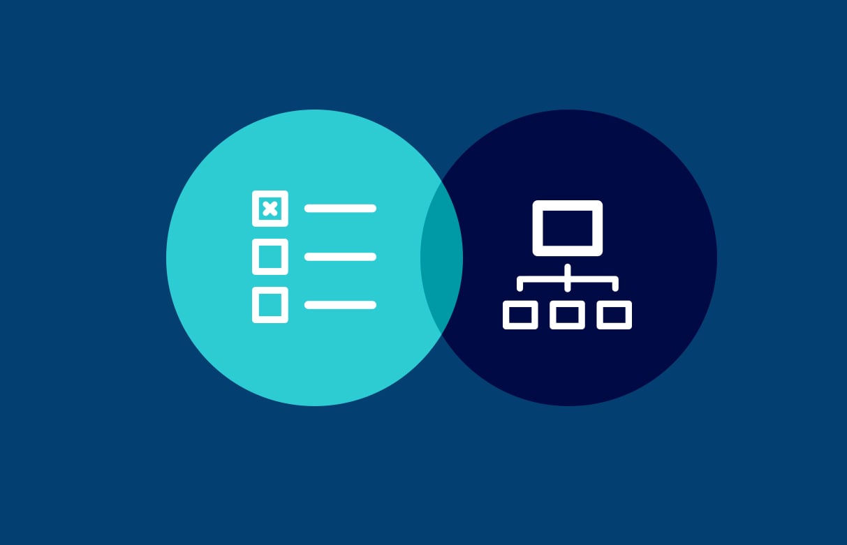
1. Include Contact Information
One of the first places people look to when they need to get in touch with an online business is the header or footer section of the site. And it just so happens that the header and footer sections are prime locations for navigation menus.
Because of this, you should strongly consider adding a dedicated Contact page as a navigation menu item, like we do here at Keen to Design.

Transparency when it comes to contact information not only gives people an easy way to get in touch, it helps instill a sense of trust in your brand.
2. Enable Breadcrumbs
No matter how big or small your website is, enabling breadcrumbs helps the user experience and prevents site abandonment.
Take a look at how online retail mogul Target does it:
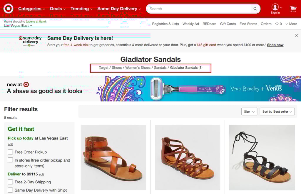
Breadcrumbs can be used as secondary navigation schemes that reveal a user’s location on a website at all times. Plus, they can help guide people back when they don’t see what they’re looking for.
3. Create a Vertical Navigation Menu
Creating a vertical navigation menu, is a great strategy if you want to stand out from everyone else and grab people’s attention in a way they’re not used to.
And as an added bonus, this unique design option will help boost site engagement and encourage people to explore your site.
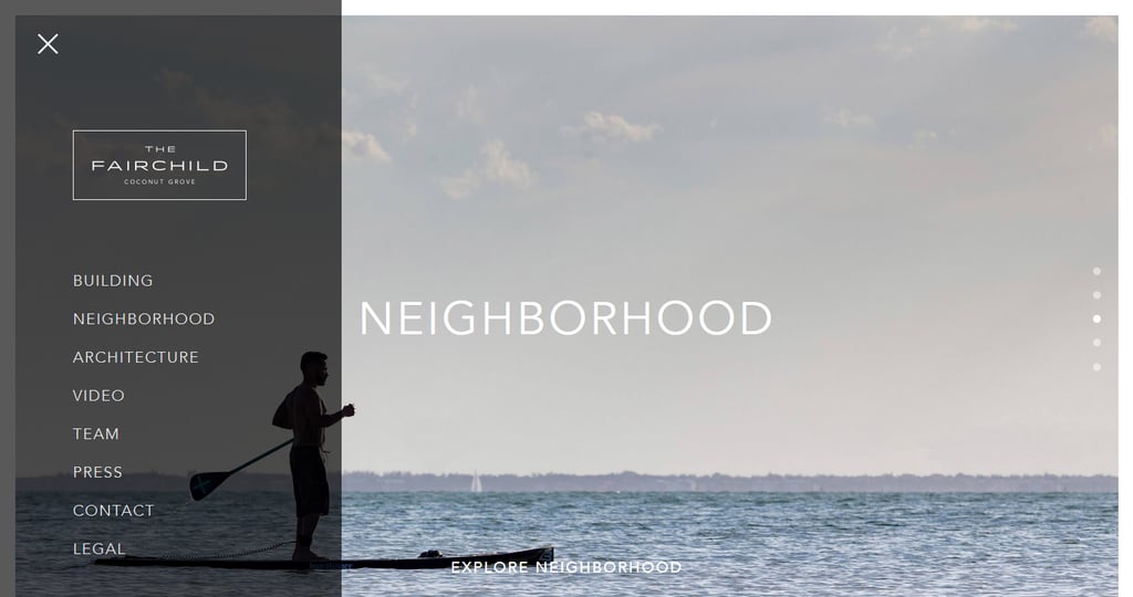
Vertical navigation menus are especially helpful for those on mobile devices, since they render so differently when compared to horizontal menus.
In fact, when they’re designed just right, as you can see using this free tool called Responsive Checker, mobile users can actually view vertical menus easier than their horizontal counterparts.
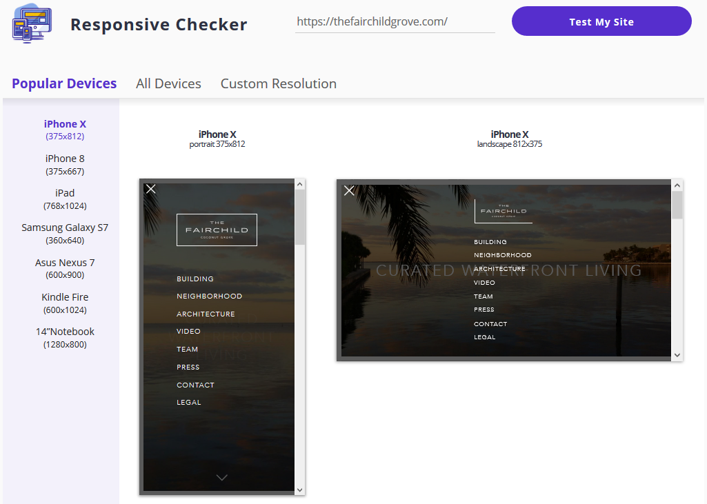
48.71% of global site traffic comes from mobile devices, making responsive design and carefully crafted navigation menus a necessity.
Just make sure your overall site design can handle vertical menu expansion. They work best on sites with large images and lots of breathing room when it comes to text. The last thing you want to do is disrupt the user experience with a large overlapping navigation menu.
4. Prioritize Menu Links
According to studies, people recall items best when they’re at the beginning or end of a list. Adding to that, items in the middle had the worst recall statistics.
Because of this, it’s important you apply the serial position effect to your navigation menus. In other words, place your most important links at the front and end of the menu.
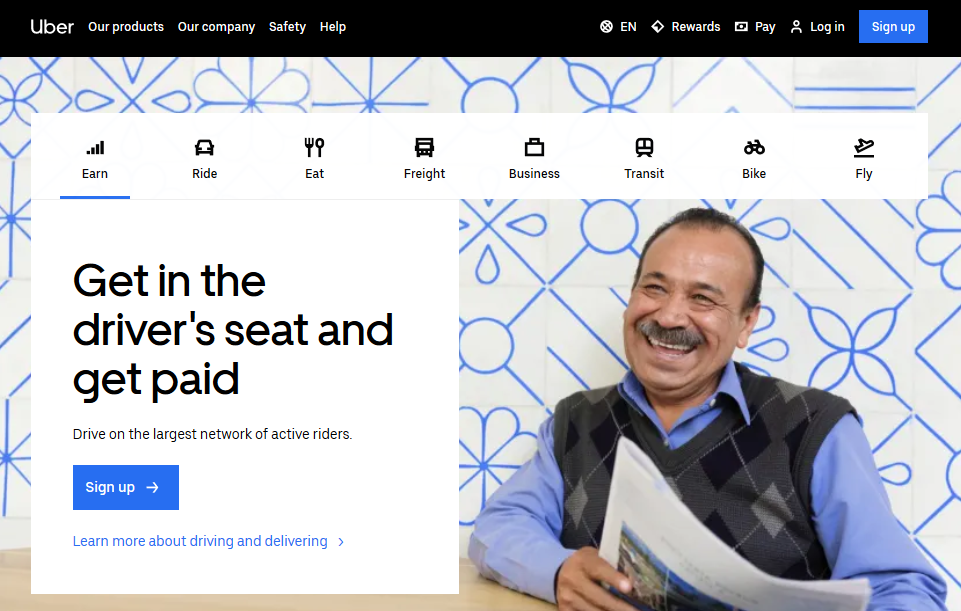
Need a little inspiration? Check out how Uber knows that earning as an Uber driver, catching an Uber ride, and aerial ridesharing are the topics their customers are most interested in.
Because they know this, they’re able to place those menu items in the beginning and end of the list of menu items.
When you follow the serial position effect, you are ensuring people see and click on your most important links and continue to explore your site. And with increased site engagement comes more subscribers and sales.
5. Make it Sticky
Fixed or sticky navigation is when the navigation menu follows users as they scroll down the webpage. This way, people have access to your navigation menu at all times, no matter how far down the page they get.
There’s nothing worse than getting all the way down a webpage and having to scroll back to the top bit by bit to continue exploring.
By making your navigation menu sticky, you make site exploration easier, increase the time spent on your site, and ultimately boost SEO, conversions, and sales.
6. Consider Fullscreen Navigation
A unique way to change up the traditional navigation menu is to create a fullscreen navigation section, like Names for Change does.
This method is for those who want the navigation of their websites to become part of the design.
It’s also for those times when you want to:
- Give people a more interactive user experience
- Create a homepage in which every element is a navigation menu that leads people elsewhere
- Combine images and text in a visually appealing way that is also fun to click on
- Design a truly one-of-a-kind website and have complete creative freedom
- Offer mobile users the easiest way to navigate your site
And there you have it! 6 of the best ways to change up your website’s navigation menus if you’re looking for increased site engagement, more subscribers, and a boost in eCommerce sales.
If you know you want to make some serious changes to your website’s overall design, navigation menus included, and just aren’t sure where to start, check out our web design services and see how we can help.
At Keen to Design, we strive to provide goal-oriented site design that will help your online business thrive. But beyond that, we aim to give your users a seamless experience while on your site so you never have to worry about them not being able to find exactly what they’re looking for the minute they arrive.