It’s easy to launch an online store these days. There’s no shortage of resources to help even the most novice of website owners, and having a small investment budget is not a problem. But what is a problem is building your online shop enough to compete with well-established brands.
After all, people typically go with what they know. And if they don’t know you, they’re going to be skeptical to spend their hard-earned cash on your products and services.
If you’ve been brushing on your eCommerce skills, you should know that a fast loading website, SEO optimisation, high-quality product images, and well-written product and service descriptions are going to help drive traffic to your site. But once people are on your website, it’s the details that matter.
When put together, it’s the tiny details on your website that are going to encourage people to engage with your brand and ultimately buy – or bounce. That’s why paying attention to the design details on your eCommerce site is crucial to you success. And it just so happens that we have some of the best design details that will wow even the most skeptical buyers and convince them to stick around, see what you have to offer, and make a purchase.
1. Simple Animations
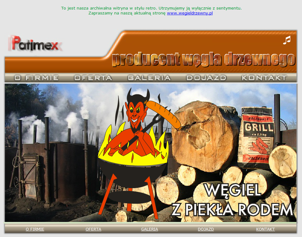
The key to adding animations to your online store is making them tiny and simple. You don’t want to be like Patimex and have a pulsating logo you can’t click on, a strange mascot moving around in the center of the screen, and blinking text fading in and out on the screen.
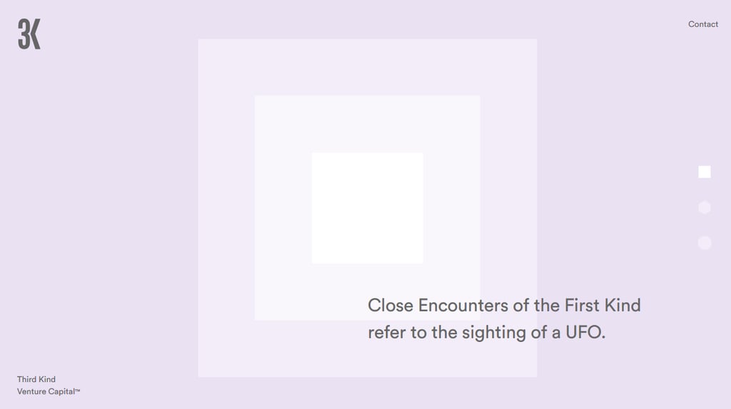
Instead, you want to be minimal in your animations and use them to barely catch the attention of your site visitor so they want to know more, not click away. For example, 3K does a good job of using subtle animations on their homepage that are soothing and engaging, not blinding to the eye.
2. Microcopy
You might think that because microcopy is not a lot of text, since it just sits inside places like text buttons, footers, and forms, that it’s easy to write and automatically makes people want to take action.
But you’re wrong.
The text you add to small parts of your website often have the biggest impact on whether a person converts or bounces.
Microcopy is used to guide people through your sales funnel or instruct people to do something specific. If you don’t make it just right, you risk losing out on many opportunities.
Take for instance, Grammarly, the online editing tool.
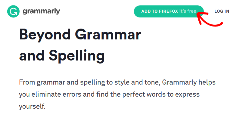
Notice on their call to action button that they not only encourage people to add the extension to their web browser, but mention that it’s free. And who doesn’t like free?
Rather than make people hunt around for a pricing page, Grammarly takes advantage of that tiny space within the CTA button to answer a question before it’s even asked. Remember, it’s the small details that make a big difference.
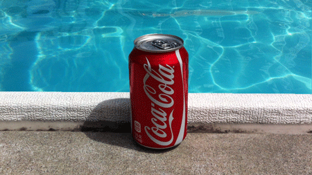
3. Cinemagraphs
Cinemagraphs (still images with a brief moment of life inside of them) work almost like animations, but are intended to keep people lingering on your page for a little bit longer (in hopes they’ll eventually convert!).
They make people happy, add to the overall user experience, and can even be considered an integral part of your marketing efforts.
You can use this design detail on your website to highlight a best-selling product, pique customer interest, or just stand out from the competition. Big name brands like Coca Cola do, so why not you?
4. Interactive Elements
Telling people something works and showing them that it works are two totally different concepts.
One of the problems consumers have when shopping online is that they can’t touch or try the product you’re selling. This makes them skeptical that what you’re saying is even true.
Want a way to help people out, even though they can’t physically touch your product before buying? Add a simple interactive tool to your homepage or product pages like Bellroy does.
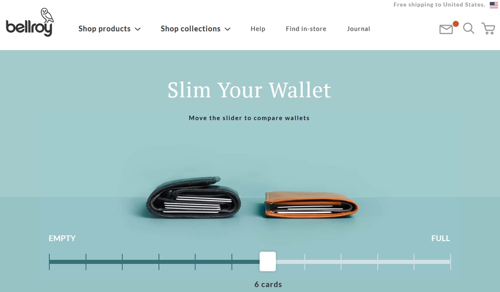
This company claims to have a wallet that is slimmer than most other options.
But how are online shoppers supposed to believe that without actually seeing the wallet in person? With an interactive wallet slimmer that’s how.
As you move the slider, you can visually see how Bellroy’s product matches up to the competition. This will ease the worry some people have about buying this product and boost sales.
5. Audio Cues
Not everyone is okay with video content automatically playing on a website. It can be startling and cause some to click away immediately. In fact, 82% of people will click away from a Facebook ad with sound that autoplays, so you can expect the same sentiment on your website.
However, using tiny audio cues on your website can spark some interaction. For example, think about the sound that you hear when you initiate a conversation with Siri on your phone. These small audio sounds can signal when a task or action has been started or completed and encourage people to continue, which will help boost conversions. Just make sure to give people the option to toggle off any sound you have on your site, just in case.
And there you have it! 5 design details that are sure to impress even the most skeptical of buyers.
The key to growing your eCommerce business is to get more people to buy. If you can stand out from your competition in a non-intrusive way, and leave a great first impression, you’ll be more likely to boost sales and retain long-term customers, which is the goal of any online shop owner.
Need help designing your eCommerce shop so that hesitant buyers change their minds?Check out our development services and get in touch today. We can help with things like web and graphic design, building a social media presence, and your overall marketing strategies so you generate more revenue than ever before.