Typography isn’t decoration. Before a visitor reads a single word, the font signals whether your website is trustworthy, contemporary, or worth their time. Getting it right matters more than most clients realise, and getting it wrong is more expensive than most designers admit.
The good news: Google Fonts gives you a library of over 1,500 professionally designed typefaces, free to use on any project, commercial or otherwise. No licensing fees, no subscriptions, no per-pageview billing. The fonts are hosted on Google’s global content delivery network and can be embedded into any website with a single line of CSS. For most web design projects, whether it’s a local tradesperson’s site in Parramatta or a SaaS product launching to a global market, Google Fonts covers the typographic brief completely.
This guide covers what’s worth using, what’s worth avoiding, how the library actually works, and what’s changed recently, including Google’s significant December 2025 decision to open-source its own brand typeface, Google Sans.
How Google Fonts Works
Understanding the mechanics helps you avoid common mistakes, particularly performance-related ones.
Step 1: Browse fonts.google.com
Filter by category (serif, sans-serif, display, handwriting, monospace), language support, or style properties like weight and width. You can type your own text into the preview window to see exactly how a font renders before committing to anything.
Step 2: Select your weights carefully
Click a font family and choose only the weights and styles you actually need. If your design uses Regular 400 and Bold 700, don’t also load Light 300, Medium 500, and Black 900 out of habit. Each additional weight increases your page load time.
Step 3: Grab the embed code
Google provides two options: a <link> tag for your HTML <head>, or a CSS @import rule. The <link> tag is generally preferred for performance, as it allows the browser to begin loading fonts in parallel with other resources.
Step 4: Apply in CSS
Use the font-family property in your stylesheet to apply the font to specific elements: headings, body text, and buttons. Set a fallback stack so the page doesn’t break if the font fails to load.
Step 5: Test across devices
Always check your chosen font on mobile, tablet, and desktop, across both Windows and macOS. Font rendering varies significantly between operating systems. A typeface that looks crisp on a Mac can appear heavier or lighter on Windows due to differences in font smoothing.
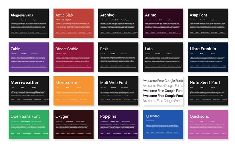
| Font name | Preview | Styles | Best for | Personality |
|---|---|---|---|---|
| ⬤ Sans-Serif — clean, modern, no decorative strokes | ||||
| Roboto | Roboto Aa | 12 | Navigation, body, UI | Geometric yet friendly |
| Open Sans | Open Sans Aa | 10 | General-purpose web | Neutral, dependable |
| Lato | Lato Aa | 10 | Corporate, body text | Sleek, elegant |
| Montserrat | Montserrat Aa | 18 | Branding, titles | Urban, versatile |
| Mulish | Mulish Aa | 14 | Minimal designs, menus | Clean, minimal |
| Cabin | Cabin Aa | 8 | Small body text | Modern, slightly rounded |
| Libre Franklin | Libre Franklin Aa | 18 | News, editorial | Strong, wide weight range |
| DM Sans | DM Sans Aa | Variable | SaaS, tech, dashboards | Precise, professional |
| Space Grotesk | Space Grotesk Aa | 5 | Design studios, startups | Quirky, distinctive |
| Google Sans | Google Sans Aa | Variable | Modern interfaces, apps | Clean, familiar, trusted |
| Questrial | Questrial Aa | 1 | Display, single-weight use | Modern, circular curves |
| ⬤ Serif — traditional, authoritative, with decorative strokes | ||||
| Merriweather | Merriweather Aa | 8 | Blog headers, long-form | Readable, literary |
| Playfair Display | Playfair Display Aa | 6 | Luxury, editorial | Elegant, high-contrast |
| Lora | Lora Aa | 4 | Body text, blogs | Warm, calligraphic |
| Noto Serif | Noto Serif Aa | 4 | Multilingual, global | Balanced, universal |
| Arvo | Arvo Aa | 4 | Headings, testimonials | Geometric slab, structured |
| ⬤ Geometric — built on circles and shapes, precise and structured | ||||
| Poppins | Poppins Aa | 18 | SaaS, apps, startups | Youthful, circular |
| Nunito | Nunito Aa | 14 | Education, apps | Rounded, friendly |
| Quicksand | Quicksand Aa | 6 | Display, lifestyle | Light, soft |
| ⬤ Handwriting — script and cursive, accent use only | ||||
| Caveat | Caveat Aa | 4 | Personal brands, food | Natural, casual |
| Dancing Script | Dancing Script Aa | 4 | Wedding, invitations | Lively, calligraphic |
| Pacifico | Pacifico Aa | 1 | Logos, café brands | Retro, laid-back |
| Sacramento | Sacramento Aa | 1 | Luxury, weddings | Romantic, flowing |
| ⬤ Monospace — fixed-width characters, essential for code | ||||
| Space Mono | Space Mono Aa | 4 | Code display, dev blogs | Quirky, retro-futuristic |
| Roboto Mono | Roboto Mono Aa | 10 | Documentation, terminals | Clean, reliable |
| Source Code Pro | Source Code Pro Aa | 9 | IDEs, technical sites | Refined, legible |
| ⬤ Display — headlines and impact only, not for body text | ||||
| Oswald | OSWALD Aa | 6 | Hero text, sports | Strong, condensed |
| Anton | ANTON Aa | 1 | Banners, events | Bold, commanding |
| Bebas Neue | BEBAS NEUE | 1 | Posters, fashion | Tall, sleek |
| Bricolage Grotesque | Bricolage Aa | Variable | Boutique, food & drink | Warm, characterful |
All fonts freely available at fonts.google.com · “Styles” = number of weight/style variations · Variable fonts offer a continuous range rather than fixed steps · Preview column rendered in each font’s actual typeface
The Five Categories of Google Fonts
Sans-Serif Fonts
Sans-serif fonts have no decorative strokes at the ends of letterforms. They’re clean, screen-optimised, and dominate web design for practical reasons: they remain legible at small sizes and across a wide range of screen resolutions. This is the category with the most options and the most variety in personality.
Roboto
One of the most widely used fonts on the internet. Roboto blends geometric precision with open curves. It is technically sound, broadly readable, and reliably neutral. It’s available in 12 styles and comes with the sister families Roboto Condensed and Roboto Slab, giving you flexibility within a single design system without switching typefaces.

Best for: Navigation menus, body text, UI elements, mobile interfaces.
Real-world use: Android’s default system font is Roboto. When a typeface is trusted to render everything from a lock-screen notification to an accessibility menu on a billion devices, that’s evidence of its functional integrity.
Open Sans
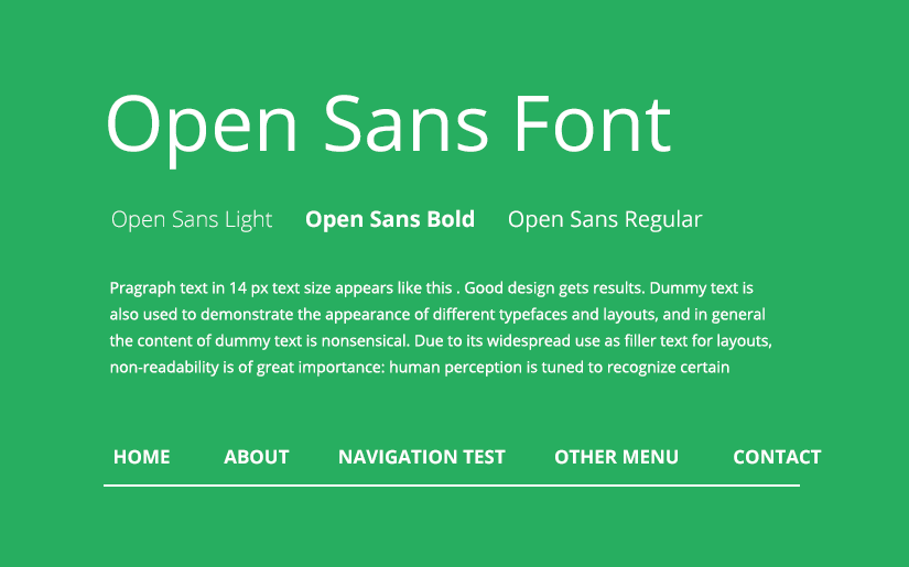
A humanist sans-serif designed by Steve Matteson. Open Sans has a friendly, neutral quality. It doesn’t carry any strong stylistic baggage, which makes it easy to pair and deploy across very different kinds of websites. Available in 10 styles, with an additional Condensed family.
Best for: General-purpose websites, blogs, e-commerce stores.
Real-world use: WordPress.com has used Open Sans across significant portions of its interface, making it one of the most-viewed fonts on the web by sheer volume of traffic.
Lato
Designed by Polish type designer Lukasz Dziedzic, Lato (Polish for “summer”) was originally commissioned for a large corporate client who ultimately went in a different direction, so Dziedzic released it as open source. That backstory shows in the font’s character: its letterforms feel both serious and warm, structured but not cold. Available in 10 weight styles.
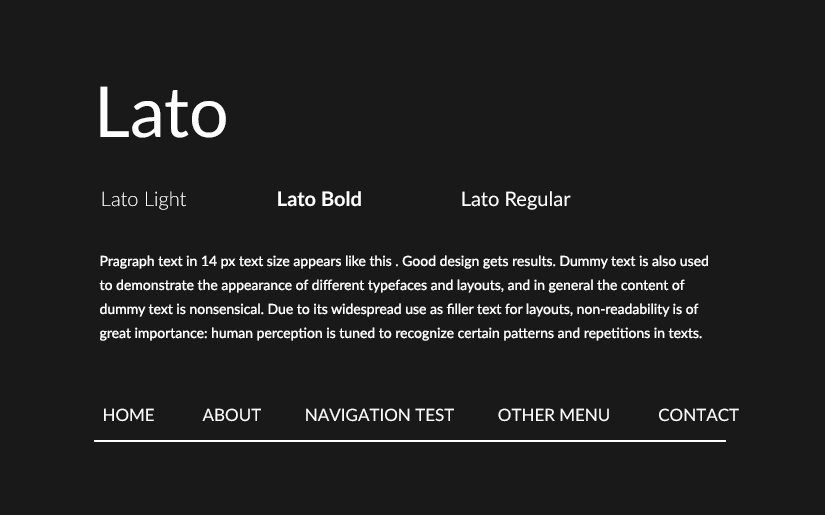
Best for: Corporate websites, professional services, legal and financial firms, headings and body text combined.
Real-world use: A legal services website using Lato Light for body text and Bold for headings communicates quiet confidence without feeling bureaucratic. That tonal range, competent but not intimidating, is genuinely difficult to achieve with a single typeface, and Lato handles it.
Montserrat
Inspired by the urban signage and typography of the Montserrat neighbourhood in Buenos Aires, this font is frequently compared to the premium paid typeface Proxima Nova. Available in 18 styles, it handles headlines, subheadings, body text, and UI labels without breaking a sweat.
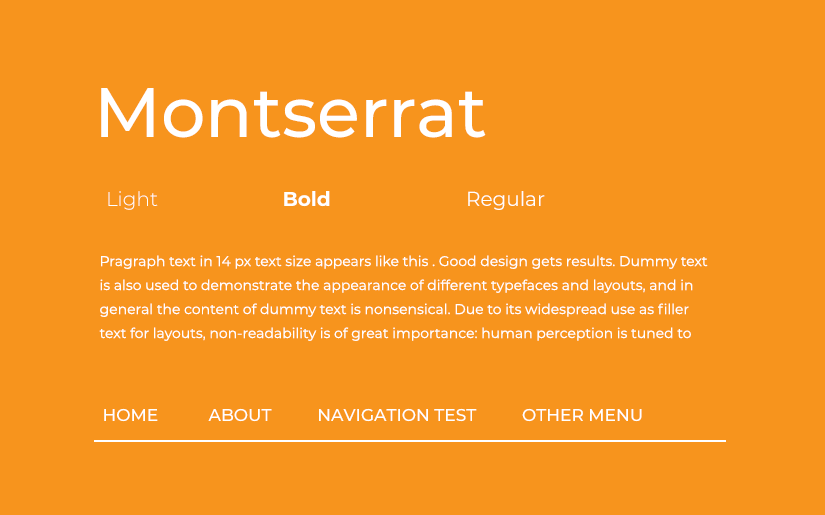
Best for: Startups, creative agencies, landing pages, titles.
Real-world use: Squarespace templates commonly default to Montserrat for headline text. It’s become something of a genre-standard for new business websites, so it’s worth pairing it with something more distinctive if brand differentiation is part of the brief.
Poppins
Designed by Indian Type Foundry, Poppins supports both Devanagari and Latin writing systems, making it one of the more globally versatile options in the library. Its geometric, circular letterforms give it a modern, youthful quality without veering into trendy. Available in 18 styles. Pairs well with Lato, Raleway, and Oswald.
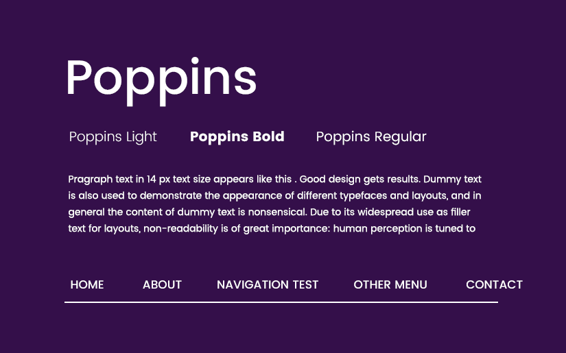
Best for: SaaS companies, mobile apps, startups targeting younger audiences, and fintech brands.
Real-world use: A fintech startup using Poppins SemiBold for its hero headline signals a modern, digital-native brand. The circularity of the letterforms reads as friendly and approachable, which matters when the product itself (finance) might otherwise feel intimidating.
DM Sans
Created by Colophon Foundry for DeepMind, DM Sans is a low-contrast geometric sans-serif with optically corrected letterforms that look unusually precise at small sizes. It’s become the quiet favourite of technology and product companies who want something refined but not ostentatious. Available in a variable font format with a wide range of weights.
Best for: Tech products, SaaS dashboards, developer tools, professional portfolios.
Real-world use: A product analytics platform using DM Sans across its documentation and UI components gives users a sense of technical credibility without the visual noise that can come with more characterful typefaces.
Space Grotesk
Adapted from Space Mono, Space Grotesk is a proportional sans-serif with quirky but controlled features: slightly irregular curves and distinctive letterforms that make it feel individual without becoming distracting. Available in 5 weights (300-700).
Best for: Design studios, creative tech startups, and UX portfolios wanting a contemporary typographic voice.
Real-world use: A UX design portfolio using Space Grotesk for headings immediately signals awareness of current type trends. It reads as considered, which matters when the portfolio itself is a demonstration of design judgement.
Bricolage Grotesque
One of the newer and more interesting additions to the Google Fonts library, Bricolage Grotesque is a variable font inspired by wood type and vernacular lettering. It has a characterful, slightly imperfect quality that adds warmth and personality to designs without sacrificing legibility. Its variable axes allow fine-grained control over width and weight.
Best for: Boutique brands, food and beverage businesses, independent retailers, and editorial headers.
Real-world use: A craft brewery’s website using Bricolage Grotesque for page titles immediately feels artisanal and specific, far more so than a geometric sans-serif would. The font does some of the brand communication work before a single word is read.
Oswald
A condensed sans-serif reworked from the classic Alternate Gothic style. Its narrow, assertive letterforms pack a lot of visual weight into a small horizontal footprint. Available in 6 styles.
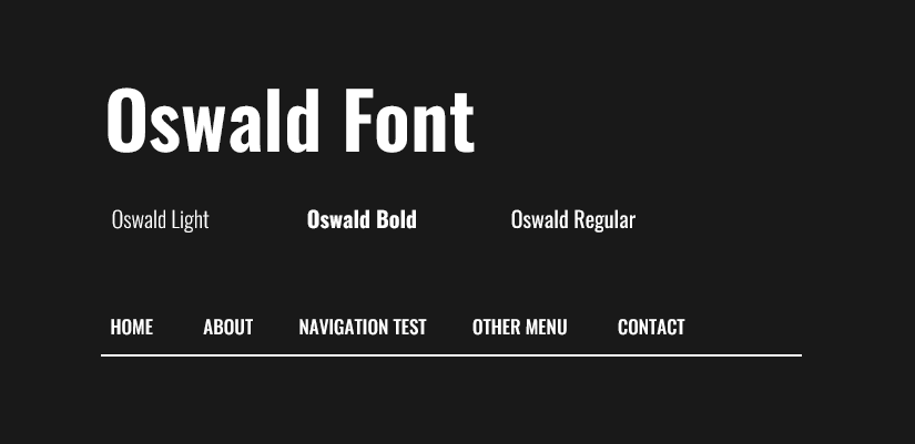
Best for: Hero headings, fitness and sports brands, bold banner text.
Real-world use: A gym or personal training website using Oswald Bold for a headline like “Train Smarter. Not Harder.” creates immediate visual impact. The condensed format works naturally at large sizes and reads well on both desktop and mobile hero sections.
Libre Franklin
A revival of the classic Franklin Gothic, available in 18 styles ranging from Thin to Black. That weight range makes it one of the most flexible options in the library. You can create real typographic hierarchy within a single font family, simplifying your font loading and keeping the design cohesive.
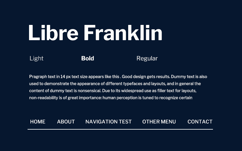
Best for: News and media sites, and brands that need a wide weight range for editorial hierarchy.
Real-world use: A digital news publication using Libre Franklin Black for breaking news headlines and Thin for article bylines gets a strong visual contrast without loading two separate font families.
Mulish (formerly Muli)
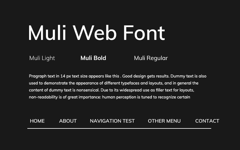
One of the most minimal sans-serif options available. Originally designed as a display font, Mulish works across headings, navigation menus, and shorter body text. Available in 14 styles. Worth noting: the font was renamed from Muli to Mulish in the Google Fonts library. Some older tutorials still use the original name.
Best for: Minimal, clean designs; navigation menus; subheadings.
Archivo
A sans-serif typeface family originally designed for headlines and titles, Archivo has expanded to serve both print and digital use cases. Available in 8 styles. Pairs naturally with Roboto.
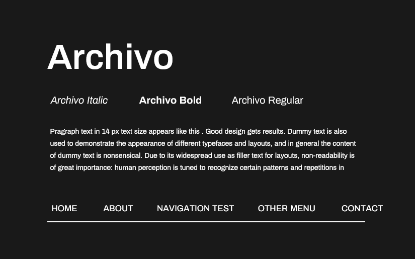
Best for: Brand identities, editorial layouts, projects that move between print and digital.
Serif Fonts
Serifs carry weight that sans serifs can’t replicate: authority, literary credibility, and a sense of permanence. On the web, they work best at larger sizes. Long body copy set in a serif requires careful weight selection; get it wrong and the strokes become visually cluttered on lower-resolution screens.
Merriweather

Designed with on-screen reading comfort as the specific brief, Merriweather is one of the few serif fonts genuinely optimised for digital rendering rather than adapted from a print original. Available in 8 styles.
Best for: Blog headings, editorial sites, long-form content platforms.
Real-world use: Medium, the publishing platform, has used serif fonts in its reading interface to signal that reading, not browsing or scrolling, is the primary purpose of the page. Merriweather serves that same editorial intent on content-focused sites that don’t have Medium’s engineering budget.
Noto Serif
Part of Google’s Noto project, which exists to eliminate “tofu”, the blank rectangles that appear when a font can’t render a character from a particular writing system. Noto Serif supports every major script and is ideal for multilingual sites where character coverage genuinely matters.
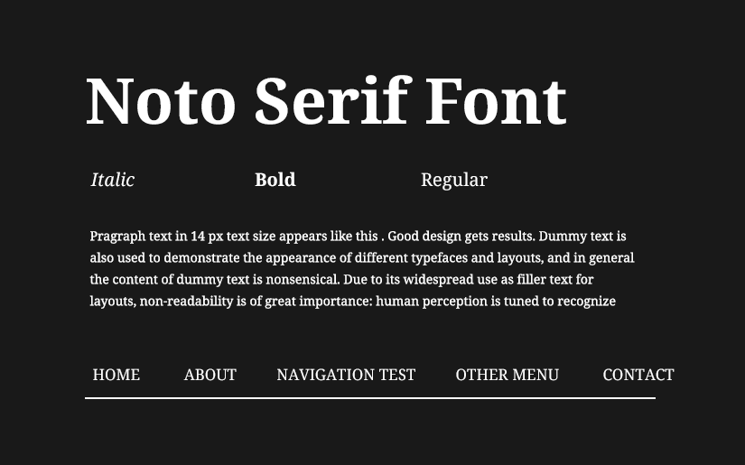
Best for: International websites, government sites, global e-commerce, and non-profits operating across multiple language regions.
Arvo
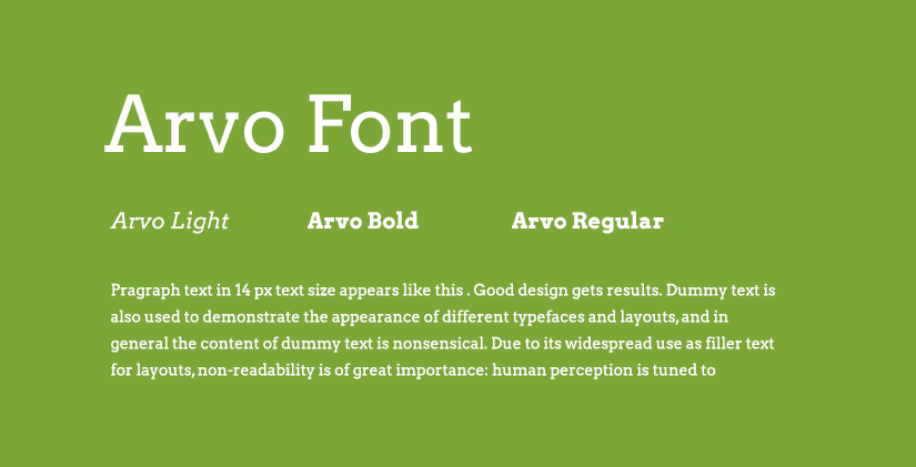
A geometric slab-serif available in 4 styles: Regular, Regular Italic, Bold, and Bold Italic. Its structured appearance suits heading text and short display copy.
Best for: Testimonial sections, headings, business websites that want a touch of typographic tradition without committing to a full editorial serif.
Display Fonts
Display fonts are designed for impact at large sizes. They are not body text fonts. Using them in paragraphs quickly causes fatigue. Their visual complexity, which reads as expressive at 80px, becomes exhausting at 16px.
Anton
A condensed, bold display font available in a single style. Its visual weight commands attention immediately, making it suited for headlines that need to stop a visitor mid-scroll.
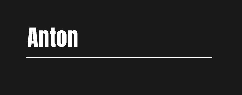
Best for: Website hero sections, promotional banners, event pages, music and entertainment brands.
Real-world use: A music festival lineup page using Anton delivers the same energy as a physical poster. The font carries that context.
Passion One
A bold, condensed display font available in 3 styles. Best used for titles and large headings where personality and legibility need to coexist.
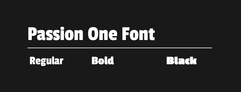
Best for: Blog titles, site headers, promotional campaigns.
Handwriting Fonts
Use handwriting fonts sparingly. They inject warmth and personality when placed correctly, such as a recipe blog title, a boutique brand tagline, or a handmade goods shop. Used too freely, they fatigue readers quickly and can come across as unprofessional.
Caveat
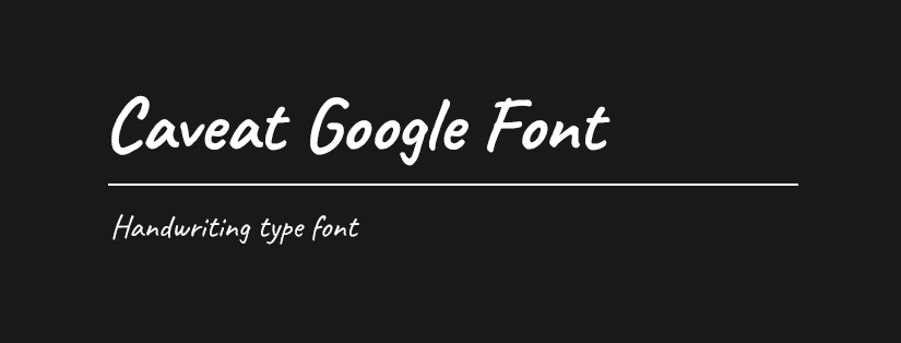
The most popular handwriting font in the Google Fonts library. Available in 2 styles, it mimics natural handwriting without looking sloppy. A companion family, Caveat Brush, adds a more textured, brushed quality.
Best for: Personal brands, recipe blogs, wedding stationery, creative portfolios.
Real-world use: A food blogger using Caveat for recipe card titles gives their site an authentic, handmade quality that a sans-serif typeface simply can’t replicate. The font communicates that a person made something. That’s the point.
Monospace Fonts
Monospace fonts allocate equal width to each character, mimicking typewriter output. They’re essential for displaying code and technical content, and occasionally used for aesthetic effect in tech-adjacent brands.
Oxygen Mono
The companion to Oxygen (a clean, readable sans-serif designed for the KDE Linux desktop project), Oxygen Mono shares its design principles in a monospaced format.

Best for: Developer documentation, technical blogs, open-source project sites.
Didact Gothic
A simple, clean sans-serif available in one style, designed specifically for learning contexts where readability and minimal visual distraction are the priorities.
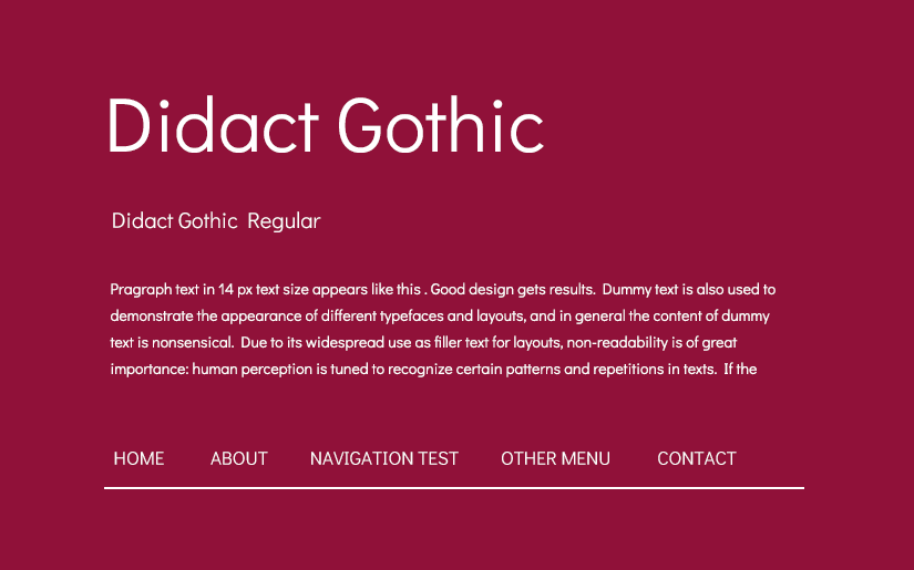
Best for: Online courses, learning management systems, educational platforms.
Google Sans: Now Open Source
Google Sans is the typeface you’ve seen millions of times without noticing: the font used across Search, Gmail, Google Maps, Pixel phones, and Google Workspace. It serves approximately 120 billion font requests per month, making it one of the most-read typefaces on Earth by any measure.
For most of its existence, Google Sans was proprietary and unavailable to the public. That changed on 10 December 2025, when Google released it under the SIL Open Font License, making the full family freely available for personal and commercial use.
The publicly available variants are:
- Google Sans: the core geometric sans-serif, clean and highly legible across a wide range of sizes
- Google Sans Flex: a variable font with five adjustable axes (weight, grade, slant, width, and roundness), designed to adapt intelligently across screen sizes and contexts. It moves from compact UI labels to large display headings, and from a playful, rounded style to a sober, authoritative one, all from a single font file
- Google Sans Code: a monospaced variant optimised for displaying code, used in Google’s Gemini product
Best for: Websites and applications wanting a polished, contemporary feel consistent with Google’s design language; developers building Material Design-influenced interfaces; anyone wanting a highly refined geometric sans-serif with exceptional legibility credentials.
Real-world use: A SaaS company using Google Sans Flex across its interface and documentation benefits from the familiarity users already have with the font, without it feeling generic. The variable axes allow precise tuning for different interface states, which is particularly useful in responsive web design.
Performance tip: Because Google Sans is now licensed under the SIL Open Font License, you can self-host it. Download the font files from fonts.google.com, add them to your server, and reference them with a @font-face rule in your CSS. This means visitors’ browsers load the font from your server directly rather than making a separate request to Google’s infrastructure. This reduces load times on slow connections and sidesteps the GDPR issue covered below.
Is It OK to Use Google Fonts on a Commercial Website?
Yes. All fonts in the Google Fonts library are released under open-source licences, typically the SIL Open Font License or the Apache License 2.0. Google’s full FAQ on font licensing covers redistribution and commercial use in detail. This means you can use them freely on any website, including commercial projects, without licensing fees, per-pageview charges, or attribution requirements. If you redistribute the font files themselves (rather than simply using them on a website), you need to include a copy of the original licence. That’s a narrow case most web projects never encounter.
Which Industries Benefit Most from Google Fonts?
Small business and professional services
Accounting firms, law offices, consultancies, and trade businesses need fonts that communicate trust without feeling cold. Lato, DM Sans, and Merriweather all strike the right balance between approachable and professional. Avoid display fonts in this category. They signal creativity when what the client actually needs to signal is competence.
E-commerce and retail
Online stores need readable product names, clear calls to action, and a typographic voice that reflects the brand. Montserrat and Open Sans work well for general retail. Bricolage Grotesque suits artisan or boutique brands. Poppins fits fashion and lifestyle e-commerce. The key is matching the font’s personality to the product category.
Technology and SaaS
Tech companies typically prefer clean, contemporary sans-serifs that feel current without being trendy. DM Sans, Space Grotesk, Google Sans, and Roboto are all strong choices. The wrong move in this category is reaching for a handwriting font or a heavy display serif. Both signal a brand personality that tech products rarely want.
Food, hospitality, and lifestyle
These industries benefit from fonts with warmth and character. Bricolage Grotesque, Caveat, and Merriweather all work depending on the specific brand’s tone. A high-end restaurant might lean toward Merriweather for gravitas; a casual cafe might use Bricolage Grotesque to feel approachable and distinctive.
Education and non-profit
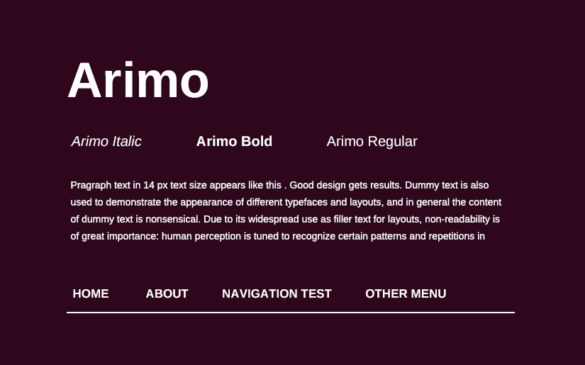
Legibility and accessibility take priority over stylistic novelty. Noto Serif, Libre Franklin, Didact Gothic, and Arimo all prioritise reading clarity. These fonts don’t make strong aesthetic statements, which is exactly right when the content itself is what needs attention.
How Do I Add Google Fonts to My Website?
Method 1: HTML <link>tag
Select fonts on fonts.google.com, click “Get embed code,” and paste the <link> tag into your HTML <head>. Apply the font using font-family in your CSS stylesheet. This is the standard method and works on any site where you can access the source code.
Method 2: WordPress plugin
The Easy Google Fonts plugin allows you to browse and apply Google Fonts from within the WordPress dashboard without touching code. Most popular themes and page builders, including Elementor, Divi, and GeneratePress, also include native Google Fonts pickers.
Method 3: Self-hosting
Download the font files from fonts.google.com or use the google-webfonts-helper tool. Host the files on your own server and reference them via @font-face in your CSS. This approach improves GDPR compliance (more on that below) and can meaningfully reduce load times for users geographically close to your server.
What Makes a Good Font Pairing?
Strong font pairing follows one of two principles: contrast (a serif heading with a sans-serif body, or a display font with a neutral workhorse), or harmony (two fonts from the same designer or with shared proportions and x-heights).
Some well-tested combinations:
- Bricolage Grotesque + DM Sans: characterful display with a clean, readable body; works well for boutique brands and creative businesses
- Merriweather + Open Sans: editorial authority with friendly legibility; a reliable choice for content-heavy sites
- Montserrat + Lato: two geometric sans-serifs with complementary personalities; effective for corporate and professional service sites
- Oswald + Libre Franklin: condensed display with a versatile, wide-ranging body; strong for media and news contexts
- Space Grotesk + Roboto: distinctive heading with the internet’s most reliable workhorse body font
One rule holds across all of them: limit yourself to two fonts. A third is occasionally justified by a specific typographic hierarchy. More than three is almost always a mistake. It signals indecision rather than sophistication.
Benefits of Using Google Fonts
Cost: Completely free for any use, personal or commercial. No per-pageview billing, no per-seat licences, no renewal fees.
Performance: Google hosts fonts on its global CDN, which means fast load times worldwide. Returning visitors often benefit from cached versions stored in their browsers. A font loaded on one site that uses Open Sans may already be cached from a previous visit to a different site.
Variety: With over 1,500 families and coverage of hundreds of languages, the library handles most design briefs without requiring a custom or premium typeface.
Variable font support: Increasingly, Google Fonts offers variable font versions. Bricolage Grotesque, DM Sans, and Google Sans Flex are all available as variable fonts. A single variable font file can serve multiple weights and widths, reducing HTTP requests and file sizes compared to loading separate static font files.
Ease of integration: Virtually every modern website builder, including WordPress, Squarespace, Wix, Shopify, and Webflow, has native Google Fonts support. Even without that, a single <link> tag is the entire integration.
Risks and Limitations
Privacy and GDPR
When a visitor loads your website, their browser makes a request to Google’s servers to download the font file. This request includes the visitor’s IP address. Under GDPR, this constitutes a transfer of personal data to a third party without the user’s explicit consent. German courts ruled in 2022 that this practice violates GDPR when no consent mechanism is in place (see: Landgericht Munchen, case no. 3 O 17493/20). The fix is self-hosting: download the font files and serve them from your own server, so no requests are made to Google’s infrastructure.
Overuse and lack of differentiation
Montserrat, Roboto, and Open Sans are on millions of websites. If your client’s brand differentiation is part of the brief, and for most commercial projects it is, consider less-saturated but equally high-quality options: Space Grotesk, Bricolage Grotesque, DM Sans, or the newly open-sourced Google Sans Flex.
Uneven quality across the library
The library includes professional-grade typefaces alongside more limited options. Some fonts have minimal language support, only one style available, or poor hinting (the process that improves rendering at small sizes on lower-resolution screens). Always test a font at actual usage sizes on actual devices before committing to it in a project.
Variable font compatibility
Modern browsers support variable fonts well. Older browsers, particularly Internet Explorer and some older Safari versions, may fall back unpredictably. If your audience includes users on older systems, test the fallback behaviour and set a sensible fallback stack.
Best Practices for Using Google Fonts
1. Legibility before aesthetics.
A beautiful font that strains the eye in a paragraph will hurt your time on site and conversion rate. Always test at actual body text sizes (16px to 18px) on a real screen before committing. What looks elegant in a preview might be painful to read across a 600-word product description.
2. Load only what you need.
Every font weight adds to page load time. If your design uses Regular and Bold, don’t load Light, Medium, SemiBold, and Black as well. This is one of the most common and easily avoided performance mistakes in web design.
3. Use a type scale.
Rather than picking font sizes by feel, use a modular scale (for example, a Major Third ratio of 1.25) to create a visual hierarchy that’s mathematically proportional. Tools like typescale.com make this straightforward to implement.
4. Prioritise accessibility.
Per WCAG 2.1 guidelines, body text requires a minimum contrast ratio of 4.5:1 between text and background. Avoid thin weights (100-300) for body text on any background that isn’t pure white. For users with low vision or reading difficulties, clarity is not optional.
5. Self-host for GDPR compliance.
If you serve visitors in the EU or UK, which most Australian businesses with international traffic do, self-hosting your Google Fonts removes the transfer of IP addresses to Google’s servers and eliminates GDPR exposure.
6. Don’t use display or handwriting fonts for body text.
Anton, Passion One, Caveat, and similar fonts are designed for large, short-term use. They become fatiguing and difficult to read at paragraph length. This rule is broken on the web constantly, usually by designers who preview the font at display size and forget to check it at 16px.
Conclusion
Google Fonts is one of the few genuinely free things in web design that doesn’t come with a meaningful catch. The library is large enough to cover most briefs, the quality tier at the top end is genuinely high, and the integration is trivial. For small business clients in particular, whether that’s a cafe in Balmain, a physio practice in Chatswood, or an accounting firm in Parramatta, it delivers what they actually need without the cost and complexity of a custom typeface.
That said, the library rewards careful selection. The difference between a site that uses Montserrat because it was the default and a site that uses Bricolage Grotesque because someone thought about what the brand needed to communicate is visible in the work.
Test your font with real content at real sizes. Load it on your phone. Run it on Windows. Self-host it if you have EU visitors. And don’t load six weights when two will do.